
18 Free Exploratory Data Analysis Tools for Non-Coders (2026 Update)

Exploratory data analysis (EDA) is a crucial first step in any data science project. But what exactly is EDA, and why is it so important?
In simple terms, EDA is the process of investigating and summarizing a dataset to understand its main characteristics, uncover patterns and relationships, and inform further analysis. It‘s a highly iterative, open-ended process that combines data wrangling, statistical analysis, and visualization to help answer questions like:
- What do the distributions of key variables look like? Are they normal, skewed, multimodal?
- Are there any outliers, missing values, or data quality issues that need to be addressed?
- How are variables correlated with each other? Are there any interesting relationships?
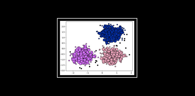
- Can the data be grouped or clustered into meaningful segments or categories?
- Are there any significant differences between subgroups or over time?
The goal of EDA is not to formally test hypotheses or build predictive models (that comes later), but rather to develop a deep, intuitive understanding of the data that will guide the rest of the data science process. In the words of renowned statistician John Tukey, who coined the term in 1961:
"Exploratory data analysis isolates patterns and features of the data and reveals these forcefully to the analyst."
According to a 2020 Kaggle survey of over 20,000 data scientists, EDA is the most time-consuming part of their workflow, taking up 19% of their time on average. It‘s also rated as one of the most enjoyable parts of the job, second only to data visualization.
But historically, doing effective EDA has required writing a lot of code in languages like Python, R, or SQL to slice and dice the data in various ways. This can be a major barrier for non-technical people who want to participate more actively in data analysis.
The good news is, that‘s changing rapidly. A new generation of powerful, code-free EDA tools are making it easier than ever for anyone to visually explore, clean, and analyze data without writing a single query. Let‘s dive in and see how!
Spreadsheets: Not Dead Yet
Despite the rapid rise of new data tools, spreadsheets remain one of the most popular and accessible ways to work with data. In the same 2020 Kaggle survey, Microsoft Excel was the third most commonly used tool for data analysis, behind only Python and SQL.
While often derided by data professionals, modern spreadsheet apps are surprisingly capable EDA tools, especially for structured, tabular datasets under a million rows or so. With pivot tables, formulas, charts, and add-ons, it‘s possible to do quite sophisticated analysis in tools like Excel, Google Sheets, and Airtable.
For example, here‘s a demo of how to quickly explore and visualize a sales dataset in Google Sheets without writing any code:
[Embedded Google Sheets EDA example]Some key advantages of using spreadsheets for EDA include:
- Familiarity and low learning curve for many users
- Flexible, ad hoc analysis without needing to define schemas upfront
- Simple built-in data cleaning and transformation tools
- Decent selection of charts and visualizations
- Huge ecosystem of add-ons and integrations to pull in data
Of course, spreadsheets have their limitations when it comes to large datasets, complex analysis, and repeatability. But for quick and dirty data exploration, they‘re still hard to beat, especially for Excel power users.
Tableau Public: Viz for the People
When it comes to interactive data visualization, Tableau is one of the most popular and powerful tools on the market. And with Tableau Public, anyone can publish, share, and explore Tableau visualizations for free.
While the desktop Tableau Creator software has a hefty price tag, Tableau Public offers much of the same drag-and-drop exploration and dashboard building capabilities at no cost. The only catch is your visualizations have to be saved to the public cloud where anyone can view and download them.
But for most EDA use cases, that‘s a small price to pay for such a flexible, intuitive tool. With Tableau, you can quickly connect to data from Excel, CSV, JSON, databases, and cloud apps, then explore it using a variety of stunning built-in visualizations.
[Embedded Tableau Public EDA example]One of my favorite Tableau features for EDA is the "Show Me" panel, which automatically suggests different chart types based on the fields and data types you‘ve selected. This can be a great way to quickly spot interesting patterns and outliers you may have missed in a table view.
Other handy EDA features in Tableau include:
- Calculated fields for creating custom metrics and ratios
- Instant aggregation, pivoting, and date/time grouping
- Filtering, highlighting, and drill-down interactions
- Built-in forecasting, clustering, and regression tools
- Dashboard and story features to combine multiple views
For more advanced users, Tableau also supports integration with R, Python, and other analytical tools via dashboard extensions. But even for non-coders, the core Tableau UI provides more than enough flexibility to answer key business questions.
KNIME Analytics Platform
Konstanz Information Miner, or KNIME for short, is a powerful open-source platform for building end-to-end data science workflows. While it has a steeper learning curve than spreadsheets or Tableau, it offers much more flexibility and control over the entire data pipeline.
At its core, KNIME uses a visual, drag-and-drop interface to let users build workflows composed of connected "nodes". Each node represents a specific data operation, such as reading data from a file, filtering rows, aggregating values, training a model, or visualizing results.
By combining these nodes, even non-programmers can create sophisticated EDA and machine learning pipelines that can be saved, shared, and re-run on new data. And with over 2000 nodes in KNIME‘s extensions hub, the possibilities are virtually endless.
[Embedded KNIME workflow example]KNIME really shines for EDA thanks to its extensive support for data cleaning, transformation, and blending tasks. With a few simple nodes, messy raw data from multiple sources can be quickly whipped into shape for analysis. Some of the most useful EDA nodes in KNIME let you:
- Handle missing values via imputation, filtering, or ML
- Detect and remove duplicate or inconsistent records
- Normalize, standardize, or discretize numeric columns
- Engineer new features via math operations or time series analysis
- Join, union, pivot, and unpivot tables in complex ways
- Sample, partition, and rebalance datasets
- Visualize univariate, bivariate, and multivariate distributions
What‘s more, KNIME makes it easy to generalize and automate EDA workflows so they can be applied repeatedly to new datasets with minimal modification. And integration with other languages and platforms is a breeze thanks to nodes for calling out to Java, Python, R, SQL, Spark, and more.
The one downside of KNIME for EDA is that the UI can be quite overwhelming at first, with so many nodes and configuration options. Expect to spend some time with the docs and tutorials to get comfortable. But for power users, KNIME is hard to beat for building production-grade EDA and ML pipelines.
Orange: Data Science Fruitful
Sticking with the fruit theme, Orange is another open-source data exploration and visualization tool that uses a visual programming front-end. Developed by researchers at the University of Ljubljana, Orange has a more academic bent than commercial tools like Tableau or KNIME.
One area where Orange really stands out is its interactive visualizations and dashboards. Rather than using a separate worksheet for building visualizations, Orange lets you explore the data directly within each widget and see the results change in real-time.
[Embedded Orange interactive viz example]This makes it great for quickly testing out different ideas and seeing how they affect the downstream workflow. And with a wide variety of widgets for graphing, mapping, and modeling, Orange supports quite advanced EDA and ML use cases.
Some of my favorite EDA widgets in Orange include:
- Scatter Plot, Distributions, and Correlations for visualizing relationships
- Box Plot, Violin Plot, and Heat Map for comparing distributions
- Mosaic Display and Sieve Diagram for exploring categorical data
- Silhouette Plot, Distance Matrix, and t-SNE for clustering
- Nomogram, Decision Tree, and Pythagorean Forest for model inspection
Another cool feature of Orange is the ability to "brush" data points in one widget and see them highlight in real-time in other linked widgets. This lets you quickly drill down into subsets of interest and see how they compare to the full dataset.
Orange also has a strong focus on education, with interactive tutorials, example workflows, and even YouTube videos baked right into the interface. For data science beginners or students, Orange is a great teaching tool that balances ease of use with exposure to key concepts.
The main limitation of Orange is performance and scalability. It loads full datasets into memory and doesn‘t handle big data as well as tools like KNIME. But for learning and exploring small to midsize datasets, it‘s an incredibly fun, visual platform.
RapidMiner Studio: Rapid EDA Prototyping
Moving up the power user curve, RapidMiner Studio is a popular data science platform that combines visual workflow building with a lightning-fast in-memory processing engine. With over 1500 native operators, it supports everything from basic EDA to automated machine learning at serious scale.
Here‘s a quick overview of what building an EDA workflow looks like in RapidMiner:
[Embedded RapidMiner Studio demo video]As you can see, the UI is quite polished and easy to navigate, with drag-and-drop operators, real-time error checking, and integrated help. RapidMiner also includes several template workflows for common EDA tasks like data cleaning, attribute selection, and statistical analysis to help you get started faster.
One thing that sets RapidMiner apart for code-free EDA is the breadth of its visualizations. In addition to standard charts like scatter plots, heat maps, and histograms, it has some nifty EDA-specific viz tools like:
- Correlation Matrix for visualizing relationships between variables
- Parallel Coordinates Plot for comparing multivariate distributions
- Density Plot for visualizing probability distributions
- Lift Chart and ROC Curve for evaluating binary classifiers
- Word Cloud for text data exploration
RapidMiner also provides a unique Auto Model tool that automates the process of training and comparing multiple models on your dataset. While not strictly necessary for EDA, it can be a useful way to quickly test out different ideas before investing in further analysis.
The main downside of RapidMiner is the cost – while there is a free tier, it‘s quite limited in terms of data size and functionality. To unlock the full power of the platform, you‘ll need a paid subscription starting around $2500/year. But for enterprise data science teams, the productivity gains can easily justify the investment.
Weka, Rattle, and DataCracker: Old but Gold
Finally, I wanted to quickly mention a few classic code-free data mining tools that can still be quite useful for EDA, especially for beginners:
-
Weka is a popular open-source collection of machine learning algorithms and data preprocessing tools developed at the University of Waikato. While quite old and basic by today‘s standards, the Weka Explorer app provides simple point-and-click access to loads of useful EDA techniques like data filtering, discretization, and dimensionality reduction. And you can‘t beat the price!
-
Rattle (the R Analytical Tool To Learn Easily) is a similar GUI tool for the R programming language. It provides a simplified interface for importing data, transforming variables, building models, and generating visualizations using common R packages. While not as flashy as RapidMiner, Rattle can be a gentle introduction to the power of EDA in R without writing code.
-
DataCracker is a more recent, cloud-based platform focused on survey data analysis and visualization. While not a general-purpose EDA tool, it has some handy features for dealing with the messy, unstructured data you often get from surveys, including text cleaning, sentiment scoring, and word clouds. The UI is also quite slick and easy to use for non-technical folks.
Again, I wouldn‘t necessarily recommend these tools for production data science work, but they can be great training wheels for learning EDA concepts and testing ideas before diving into code.
Comparison Table
Here‘s a quick comparison table summarizing the key features and use cases of the code-free EDA tools covered:
| Tool | Data Sources | Visualization | ML/Stats | Sharing | Best For |
|---|---|---|---|---|---|
| Excel | Local files, APIs | Built-in charts | Basic modeling | Local, cloud | Quick ad hoc analysis |
| Google Sheets | Local files, APIs, BigQuery | Built-in charts, Explore | Basic modeling, GAM | Cloud | Collaboration, BI |
| Tableau Public | Local files, APIs, databases | Drag-and-drop dashboards | Forecasting, clustering | Public cloud | Interactive viz, dashboards |
| KNIME | Local files, APIs, databases, big data | Built-in charts, web views | Extensive modeling, DL | Local, server | Complex workflows, ML pipelines |
| Orange | Local files | Interactive widgets | Basic modeling, eval | Local, cloud | Education, exploration |
| RapidMiner | Local files, APIs, databases, big data | Extensive built-in charts | Auto ML, DL, text mining | Local, server, cloud | Enterprise data science |
| Weka | Local files | Basic charts | Classic ML algorithms | Local | Learning ML concepts |
| Rattle | Local files | Basic R charts | Classic ML in R | Local | Intro to R without code |
| DataCracker | Survey data | Dashboards, word clouds | Text analysis | Cloud | Survey exploration |
Of course, this is far from an exhaustive list – there are loads of other great code-free EDA tools out there, from open-source frameworks like Trifacta Wrangler and Qlik to commercial platforms like Alteryx Designer and Databricks AutoML.
But the tools covered here are some of the most popular and representative options for non-coders looking to up their EDA game. They range from simple spreadsheet tools to sophisticated visual programming environments, but they all share a common goal of democratizing data exploration and insights.
Final Thoughts
As an AI expert and educator, I‘m incredibly excited by the recent trends in code-free data tooling. By abstracting away the low-level programming details, these tools are empowering non-technical domain experts to participate more directly in the data science process. And that‘s ultimately a good thing for everyone.
But of course, no tool is a complete substitute for statistical know-how and critical thinking. Point-and-click EDA platforms are not an excuse to turn off your brain – if anything, they require even more active engagement and skepticism from the user.
Just because you can visualize your data in 100 different ways doesn‘t mean you should. And correlation still doesn‘t equal causation, no matter how many nodes are in your KNIME workflow.
At the end of the day, the human in the loop is still the most important part of any EDA process. The best tools simply give us higher-leverage ways to combine our domain knowledge and intuition with the power of data. They let us move faster, explore further, and communicate our insights with greater impact.
So whether you prefer spreadsheets, interactive dashboards, or full-blown data mining platforms, I encourage you to experiment with different EDA tools and find what works best for your needs. The more comfortable you get exploring and questioning data, the better prepared you‘ll be to contribute to real-world data science projects.
Because while EDA may "just" be the first step in the data science lifecycle, it‘s often the most critical one. Time spent upfront understanding your data universe is rarely wasted. And with today‘s code-free EDA tools, there‘s never been a better time to start your journey.
Happy exploring!



)