
Mastering Area Charts in Python with Plotly Express
Introduction to Area Charts
Area charts are a powerful data visualization tool that allow you to display quantitative data over a continuous interval or time period. They are similar to line charts, but with the area between the line and the axis filled in with color or shading. This makes it easy to see how a variable changes in proportion to the whole over time.
Area charts are commonly used to visualize trends, patterns, and the composition of a total quantity. Some examples of data that work well with area charts include:
- Population growth over time
- Sales revenue by product category
- Website traffic sources
- Stock price and trading volume
Why Use Area Charts?
There are several advantages to using area charts for data visualization:
-
They clearly show overall trends and patterns in the data. The filled-in area makes it easy to see how values are changing relative to each other and the total.
-
They can handle large and complex datasets. By stacking or overlapping areas, you can display multiple series without the chart becoming cluttered or confusing.
-
They work well for both absolute and relative values. You can use area charts to show totals (eg total sales) or proportions (eg market share).
-
They make it easy to identify anomalies. Any unusual spikes, dips, or gaps in the filled area will stand out visually.
-
They are aesthetically pleasing. The colorful, filled-in areas can make your charts more engaging and memorable for viewers.
Creating Area Charts with Plotly Express
While there are many charting libraries available for Python, Plotly Express (included in the Plotly library) stands out for its simplicity and flexibility. With just a few lines of code, you can create professional-quality area charts that are interactive and customizable.
Here are the basic steps to create an area chart with Plotly Express:
-
Install Plotly (if you haven‘t already) with pip install plotly
-
Import Plotly Express (usually aliased as px)
-
Prepare your data in a Pandas DataFrame
-
Call px.area() with your DataFrame and specify the x and y parameters
-
Use the various optional parameters to customize your chart
-
Display the chart with fig.show() or save it with fig.write_html()
Here‘s a basic example:
import plotly.express as px
data = {‘Date‘: [‘2022-01-01‘, ‘2022-02-01‘, ‘2022-03-01‘, ‘2022-04-01‘],
‘Sales‘: [1000, 1500, 1200, 2000]}
df = pd.DataFrame(data)
fig = px.area(df, x=‘Date‘, y=‘Sales‘)
fig.show()
This code will produce an interactive area chart showing the sales data over time. You can hover over any point to see the exact values, zoom in and out, and even save the chart as a PNG image.
Customizing Your Area Charts
One of the benefits of using Plotly Express is the ability to easily customize your charts to fit your specific needs. Here are some of the most useful parameters you can use with px.area():
- title: Sets the title of the chart
- labels: Customizes axis and legend labels
- template: Applies a predefined layout template (eg ‘plotly_dark‘)
- width and height: Sets the dimensions of the chart in pixels
- color_discrete_sequence: Defines a color palette to use
For example:
fig = px.area(df, x=‘Date‘, y=‘Sales‘,
title=‘Sales Over Time‘,
labels={‘Date‘:‘Month‘, ‘Sales‘:‘Total Revenue‘},
template=‘plotly_dark‘,
width=800, height=500,
color_discrete_sequence=[‘darkblue‘])
This code will create an area chart with a dark background, custom title and axis labels, and a width of 800 pixels. The area will be filled in with a dark blue color.
You can also use CSS to further style your charts by writing your own .css file or using the fig.update_layout() function to set style parameters directly.
Advanced Area Chart Techniques
Once you‘re comfortable creating basic area charts, you can start exploring some more advanced techniques to take your visualizations to the next level. Some possibilities include:
Stacked Area Charts
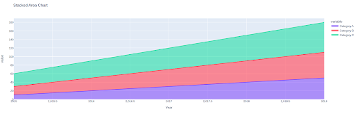
Stacked area charts are used to show how individual values change in proportion to the total over time. To create a stacked area chart, simply pass multiple y parameters to px.area():
fig = px.area(df, x=‘Date‘, y=[‘Sales‘, ‘Expenses‘, ‘Profit‘],
title=‘Financial Performance‘)
This will produce a chart with Sales, Expenses and Profit plotted as separate areas that stack on top of each other. The total height at each point represents the total across all variables.
Grouped Area Charts
Grouped area charts are used to compare two or more series side-by-side. To create a grouped area chart, use the facet_col or facet_row parameter:
fig = px.area(df, x=‘Date‘, y=‘Expenses‘, color=‘Department‘,
facet_col=‘Department‘, title=‘Expenses by Department‘)
This will create a separate area chart for each department showing how expenses change over time. The charts will be displayed in a grid based on the facet parameter.
Normalized Area Charts
Normalized area charts are used to compare the relative proportions of different series regardless of their absolute totals. To create a normalized area chart, set the groupnorm parameter to either ‘fraction‘ or ‘percent‘:
fig = px.area(df, x=‘Date‘, y=[‘Sales‘, ‘Expenses‘, ‘Profit‘],
groupnorm=‘percent‘, title=‘Financial Performance‘)
This will plot each variable as a percentage of the total, with the areas adding up to 100% at each point. This makes it easy to see the relative contribution of each series.
Plotly‘s Wide Range of Other Charts
In addition to area charts, Plotly Express includes functions for a variety of other chart types including:
- line charts (px.line)
- bar charts (px.bar)
- histograms (px.histogram)
- scatter plots (px.scatter)
- heat maps (px.density_heatmap)
- box plots (px.box)
- violin plots (px.violin)
- strip charts (px.strip)
Many of these support the same parameters and customization options as px.area(), allowing you to create a wide range of interactive visualizations with a consistent look and feel.
Best Practices for Effective Area Charts
To create area charts that are clear, accurate, and persuasive, follow these best practices:
-
Choose an appropriate time scale and axis range. Make sure your chart covers a suitable time period and that the vertical axis starts at a logical baseline (usually zero).
-
Limit the number of series. Too many overlapping areas can make a chart unreadable. Consider grouping or aggregating series if you have more than 4-5.
-
Use visually distinct colors. This is especially important for stacked or grouped area charts. Avoid similar shades that are hard to tell apart.
-
Add direct labeling if needed. If the data is highly variable or series intersect a lot, adding labels can help clarify which series is which.
-
Provide interactivity for exploration. Allow users to zoom in, see details on hover, and turn series on and off. Plotly Express makes this easy with its interactive features.
-
Facilitate comparisons. If the goal is to compare series, consider a grouped or small multiples layout rather than stacking.
-
Explain what the areas represent. A brief subtitle or caption can help orient viewers, especially if the area calculation is complex (eg accumulated interest).
Common Pitfalls to Avoid
When creating area charts (especially stacked ones), there are a few common mistakes to watch out for:
-
Using absolute numbers for dissimilar series. For example, plotting cars sold vs dollars of revenue will cause the cars area to be compressed down. Use a normalized chart or two separate axes instead.
-
Plotting too many series. More than 4-5 areas tends to blur together and overwhelm readers. Consider using small multiples or interactivity to handle larger numbers of series.
-
Choosing a 3D perspective. Adding a 3D effect skews the data and makes areas hard to compare. Stick with a standard 2D area chart.
-
Inconsistent or confusing colors. Make sure each series has a unique, perceptually distinct color. Use a single color palette for stacked areas. Avoid patterns and gradients which reduce contrast.
-
Stretching the truth. Area charts can sometimes exaggerate rate of change due to the filled areas. Be cautious about truncating the y-axis as this further distorts the data.
Real-World Area Chart Use Cases and Examples
To see how area charts can be applied to real data, here are a few examples from different industries:
Sales Performance Dashboard
An ecommerce company wants to track sales revenue by product category over the past year to see which ones are growing or shrinking in relation to overall sales. They create a stacked area chart with total sales and a grouped area chart showing each category‘s sales as a separate series.
Web Traffic Sources
A website owner wants to understand where their traffic is coming from and how the sources have changed over time. They pull Google Analytics data into a DataFrame and create an interactive stacked area chart showing pageviews by source (eg Organic, Social, Referral, Direct). Hovering over each source shows the exact numbers.
Stock Price Chart
A financial analyst wants to visualize the stock price movement of a company over the past 5 years along with the trading volume. They use Plotly‘s px.area to plot the closing price as a line and add the trading volume as a secondary fill area with partial transparency. This two-series combo chart highlights the relationship between price and volume.
App Usage
A mobile app developer wants to see how usage of their app‘s key features has evolved since launching a major update. They aggregate the event tracking data by week and by feature, then plot each feature on a separate grouped area chart. The small multiples layout allows easy comparison of growth curves.
Sentiment Analysis
A market researcher has categorized a large volume of social media posts about a brand as Positive, Negative, or Neutral. To see how sentiment has shifted over time in relation to key PR events, they create a stacked area chart showing the percentage breakdown of each sentiment by day. Annotations are added to mark major events.
Comparing Plotly to Other Python Data Viz Libraries
While Plotly Express is a powerful and flexible option for creating area charts in Python, there are other popular data visualization libraries to consider:
-
Matplotlib: The oldest and most widely-used Python data viz library. Offers basic area chart support through the plt.stackplot() function. More lightweight than Plotly but also less interactive and customizable.
-
Seaborn: A statistical data visualization library based on Matplotlib. Supports bivariate and time series area charts through the sns.stackplot() function. Simpler to use than raw Matplotlib but still fairly limited compared to Plotly.
-
Bokeh: An interactive data visualization library that can output charts as HTML files or web apps. Has an area() glyph for creating stackable, interactive area charts. More flexibility than Matplotlib or Seaborn but a steeper learning curve.
-
Altair: A declarative statistical data viz library based on Vega and Vega-Lite. Supports interactive multi-series area charts with a grammar of graphics syntax. Elegant and concise to code but less mature than other options.
Compared to these alternatives, Plotly Express offers the best balance of power and ease of use for creating a wide variety of interactive, web-ready area charts.
The Future of Area Charts
As data visualization continues to evolve, we can expect to see area charts adapt and advance in a few key ways:
-
More intelligent default settings. Libraries like Plotly are using statistical heuristics and machine learning to automatically choose optimal chart settings based on the inputted data. This makes creating effective visualizations faster and more foolproof.
-
Richer interactivity. The ability to drill down, zoom, filter, and see details-on-demand is becoming standard for data viz. Area charts will increasingly allow users to explore the stories behind the filled shapes.
-
Animation. Expect to see more area charts that use motion to show how data evolves over time or how different series relate. For example, racing bar charts and spiral charts.
-
3D and immersive VR. While not yet mainstream, there is potential to create area charts that can be explored in three dimensions using virtual reality. This could allow whole new ways of comparing series.
Of course, the core value of area charts – using filled shapes to show how quantities change in relation to a total – will remain no matter the current tech. By following best practices and taking advantage of tools like Plotly, you‘ll be able to create impactful and memorable area charts for years to come.


