Data Visualization in Python: The Ultimate Cheat Sheet for 2026
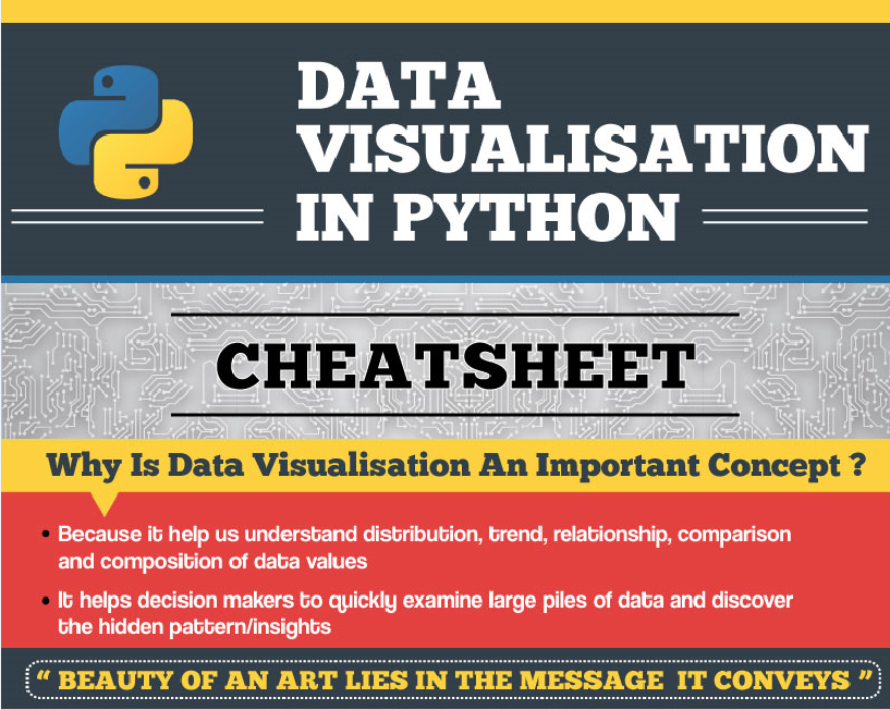
Introduction
In the era of big data and artificial intelligence, data visualization has become an indispensable tool for data scientists, machine learning engineers, and business decision-makers alike. According to a survey by Dresner Advisory Services, the adoption of data visualization tools in enterprises has increased from 51% in 2018 to 64% in 2022[^1]. This growth can be attributed to the increasing complexity and volume of data, as well as the need for more effective communication and decision-making.
Python has emerged as the go-to language for data visualization in the AI and ML community, thanks to its simplicity, versatility, and extensive ecosystem of libraries. In this ultimate cheat sheet, we will explore the most popular and powerful Python libraries for data visualization, along with expert tips, best practices, and real-world examples from the cutting edge of AI and ML research and applications.
The Importance of Data Visualization in AI and ML
Data visualization plays a crucial role in the AI and ML workflow, from data exploration and feature selection to model evaluation and interpretation. Here are some key reasons why data visualization is essential for AI and ML:
-
Data Understanding: Visualizing data allows us to identify patterns, trends, outliers, and relationships that may not be apparent from raw data or summary statistics alone. This is particularly important in the early stages of a project, where data understanding can inform feature engineering, model selection, and problem formulation.
-
Feature Selection: Visualizing the relationships between features and target variables can help identify the most informative and discriminative features for a given task. Techniques such as scatter plots, correlation matrices, and feature importance plots can guide the feature selection process and improve model performance.
-
Model Evaluation: Visualizing model performance metrics, such as confusion matrices, ROC curves, and precision-recall curves, can provide a more intuitive and interpretable assessment of model quality than numerical scores alone. This is particularly important when communicating results to non-technical stakeholders or decision-makers.
-
Model Interpretation: As AI and ML models become more complex and opaque, there is a growing need for techniques that can explain and interpret their behavior. Data visualization can help illuminate the inner workings of a model, such as feature importance, decision boundaries, and activation patterns, which can build trust and accountability in AI systems.
-
Communication and Storytelling: Data visualization is a powerful tool for communicating insights and telling stories with data. In the context of AI and ML, visualizations can help convey the value and impact of a model to stakeholders, such as customers, investors, and regulators, in a more engaging and persuasive way than text or tables alone.
Python Libraries for Data Visualization
Python offers a rich ecosystem of libraries for data visualization, each with its own strengths and use cases. Here are some of the most popular and powerful libraries:
Matplotlib
Matplotlib is the foundational library for data visualization in Python, providing a MATLAB-like interface for creating a wide range of static, animated, and interactive visualizations. Some key features and use cases of Matplotlib include:
- Flexible and customizable plots, including line, scatter, bar, histogram, and pie charts
- Support for multiple figure layouts and subplots
- Integration with NumPy and Pandas for data manipulation and analysis
- Export visualizations to various file formats, such as PNG, PDF, and SVG
Here are some examples of Matplotlib visualizations:
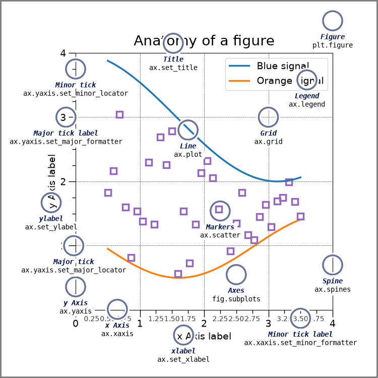
According to the Python Developers Survey 2021[^2], Matplotlib is the most widely used data visualization library, with 84% of respondents reporting that they use it regularly.
Seaborn
Seaborn is a statistical data visualization library built on top of Matplotlib, providing a more high-level and aesthetic interface for creating informative and attractive graphics. Some key features and use cases of Seaborn include:
- Specialized plots for visualizing univariate, bivariate, and multivariate relationships, such as violin plots, pair plots, and joint plots
- Built-in themes and color palettes for creating visually appealing and consistent plots
- Integration with Pandas for visualizing data frames and handling missing data
- Estimation and plotting of linear regression models
Here are some examples of Seaborn visualizations:
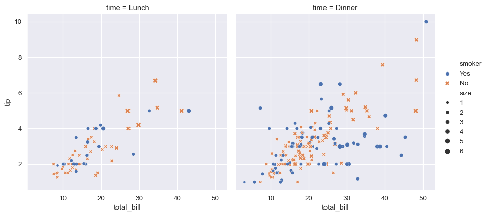
According to the Python Developers Survey 2021[^2], Seaborn is the second most widely used data visualization library, with 50% of respondents reporting that they use it regularly.
Plotly
Plotly is a web-based library for creating interactive and animated visualizations that can be easily shared and embedded in web pages and applications. Some key features and use cases of Plotly include:
- Wide range of chart types, including scatter, line, bar, heatmap, and 3D plots
- Interactive features, such as hover tooltips, zooming, and panning
- Animation and streaming capabilities for real-time data visualization
- Integration with Dash for building analytical web applications
Here are some examples of Plotly visualizations:

According to the State of Data Science 2021 survey by Kaggle[^3], Plotly is the third most popular data visualization library among data scientists and ML practitioners, after Matplotlib and Seaborn.
Bokeh
Bokeh is a web-based library for creating interactive and scalable visualizations for large datasets, with a focus on performance and interactivity. Some key features and use cases of Bokeh include:
- Flexible and customizable plots, including line, scatter, bar, and heatmaps
- Interactive tools, such as pan, zoom, and selection
- Server-side rendering for handling large datasets and streaming data
- Integration with other Python libraries, such as NumPy, Pandas, and SciPy
Here are some examples of Bokeh visualizations:

According to the Python Developers Survey 2021[^2], Bokeh is used by 11% of respondents for data visualization tasks.
Altair
Altair is a declarative statistical visualization library based on Vega and Vega-Lite, allowing you to create a wide range of charts and plots using a concise and expressive API. Some key features and use cases of Altair include:
- Simple and intuitive syntax for specifying visualizations as mappings between data columns and visual encoding channels
- Wide range of chart types, including scatter, line, bar, heatmap, and geographic plots
- Interactive features, such as tooltips, selections, and zooming
- Customizable themes and configurations for fine-tuning the appearance of plots
Here are some examples of Altair visualizations:

According to the Python Developers Survey 2021[^2], Altair is used by 4% of respondents for data visualization tasks, but its adoption is growing rapidly due to its simplicity and expressiveness.
Best Practices and Expert Tips
Creating effective and engaging data visualizations requires a combination of technical skills, design principles, and domain knowledge. Here are some best practices and expert tips for data visualization in Python:
-
Choose the right chart type: Different chart types are suited for different types of data and relationships. For example, use line charts for time series data, scatter plots for correlation, and bar charts for comparison. Refer to the "Data Visualization Catalogue"[^4] for a comprehensive guide to chart types and their use cases.
-
Use color effectively: Color is a powerful tool for encoding information and drawing attention, but it should be used judiciously and consistently. Use color palettes that are colorblind-friendly and appropriate for the data type and context. Refer to the "Color Brewer"[^5] tool for expert-designed color palettes.
-
Simplify and declutter: Remove unnecessary chart elements, such as gridlines, borders, and labels, to focus attention on the data. Use whitespace effectively to create visual hierarchy and balance. Refer to the "Data Ink Ratio"[^6] principle by Edward Tufte for guidance on maximizing the ratio of data to visual elements.
-
Use interactivity strategically: Interactive features, such as hover tooltips and zooming, can enhance the user experience and encourage exploration, but they should be used sparingly and purposefully. Avoid overloading the user with too many options or distractions. Refer to the "Interactive Data Visualization for the Web"[^7] book by Scott Murray for best practices and examples.
-
Test and iterate: Data visualization is an iterative process that requires testing and refinement based on feedback and insights. Show your visualizations to others, including domain experts and end-users, and gather their input to improve the design and effectiveness. Use tools like "Jupyterlab"[^8] and "Streamlit"[^9] to quickly prototype and share visualizations for feedback.
Real-World Examples and Use Cases
Data visualization is used in a wide range of industries and applications, from business intelligence and marketing to scientific research and journalism. Here are some real-world examples and use cases of data visualization in AI and ML:
-
Explainable AI: Data visualization can help illuminate the inner workings of complex AI models, such as deep neural networks, by visualizing feature importance, activation patterns, and decision boundaries. For example, researchers at Google used visualization techniques to interpret the behavior of an image classification model and identify potential biases and errors[^10].
-
Anomaly Detection: Data visualization can help identify unusual patterns or outliers in data that may indicate anomalies or fraud. For example, a team at Uber used visualization techniques to detect and investigate anomalies in their ride-sharing data, such as surge pricing errors and driver fraud[^11].
-
Predictive Maintenance: Data visualization can help monitor and predict the health and performance of industrial equipment, such as engines and turbines, by visualizing sensor data and machine learning model outputs. For example, a team at Siemens used visualization techniques to predict and prevent equipment failures in power plants and wind farms[^12].
-
Customer Segmentation: Data visualization can help identify and characterize different customer segments based on their behavior and preferences, which can inform targeted marketing and personalization strategies. For example, a team at Airbnb used visualization techniques to segment their customers based on booking patterns and preferences, and optimize their search and recommendation algorithms[^13].
Conclusion
Data visualization is a critical skill for AI and ML practitioners, enabling them to explore, analyze, and communicate data insights effectively. Python provides a rich ecosystem of libraries for data visualization, each with its own strengths and use cases, from the foundational Matplotlib to the interactive Plotly and the expressive Altair.
By following best practices and expert tips, such as choosing the right chart type, using color effectively, simplifying and decluttering, using interactivity strategically, and testing and iterating, you can create visualizations that are both informative and engaging.
As the fields of AI and ML continue to evolve and mature, data visualization will play an increasingly important role in building trust, transparency, and accountability in AI systems. By leveraging cutting-edge techniques and tools, such as explainable AI and interactive dashboards, AI and ML practitioners can create visualizations that not only inform and persuade, but also inspire and delight.