The Ultimate Guide to Data Visualization: An AI and Machine Learning Perspective
Data visualization is a crucial tool in the data scientist‘s toolkit, allowing us to explore, understand, and communicate insights from data. As artificial intelligence (AI) and machine learning (ML) reshape industries from healthcare to finance, data visualization is evolving in tandem – becoming more automated, intelligent, and integral to the AI/ML workflow.
In this in-depth guide, we‘ll explore the cutting edge of data visualization through an AI and ML lens. We‘ll dive into key considerations for selecting the right visualization, compare common chart types, and share expert tips and resources. Plus, we‘ll examine the ways AI is transforming data visualization – from automating chart selection to powering interactive, self-service analytics.
Whether you‘re a seasoned data scientist or an AI enthusiast looking to up your data viz game, this guide will give you the knowledge and tools you need to create stunning, effective visualizations in the age of AI. Let‘s dive in.
The Role of AI and Machine Learning in Data Visualization
Traditionally, data visualization has been a largely manual process – requiring skilled analysts to select the appropriate chart type, design the layout, and interpret the results. However, recent breakthroughs in artificial intelligence and machine learning are transforming every stage of the data visualization workflow:
-
Automated Chart Selection: Machine learning algorithms can analyze a dataset and automatically recommend the best chart type based on the data structure, fields, and use case. For example, Salesforce‘s Einstein Analytics includes an "Automated Chart Visualization" feature that uses ML to suggest chart types.
-
Natural Language Interfaces: Conversational AI and natural language processing (NLP) enable users to create visualizations using plain English queries, lowering the barrier to entry. Ask Data, a natural language feature in Tableau, allows users to ask questions like "sales by region" and get an appropriate visualization in response.
-
AI-Powered Insights: AI techniques such as clustering, anomaly detection, and predictive modeling can surface hidden insights in data that might be missed by manual exploration. Tools like Outlier can automatically flag key drivers, trends, and outliers in visualizations.
-
Automated Data Storytelling: Natural language generation (NLG) can automatically create narrative explanations to accompany visualizations, making insights more accessible and actionable. Quill, an NLG platform, generates custom chart titles and takeaways to highlight key points.
According to a 2020 Gartner report, AI-powered automation will be a dominant driver of new purchases of analytics and business intelligence platforms by 2022. As Saikat Neogi, Senior Director at Genpact, explains:
"AI technologies such as machine learning and natural language interfaces are making data visualization more accessible, insightful, and actionable for users across the enterprise. By automating tedious manual processes and surfacing hidden patterns, AI allows data scientists to focus on higher-value tasks and empowers business users to self-serve insights."
However, realizing the full potential of AI in data visualization requires careful design and implementation. Damien Brophy, VP of Data & Analytics at ThoughtSpot, shares some key considerations:
"When incorporating AI into data visualization tools, it‘s crucial to strike the right balance between automation and user control. Black-box recommendations can be useful, but users also need the ability to customize, drill down, and ask follow-up questions. The most effective AI-powered visualization tools combine intelligent automation with an intuitive, transparent user experience."
Data Visualization Adoption and Impact
The demand for data visualization skills and tools has skyrocketed in recent years as data volumes grow and data-driven decision making becomes the norm. Let‘s look at some key data points on data visualization adoption and impact:
- The global data visualization market is expected to reach $19.2 billion by 2027, growing at a CAGR of 10.4% from 2020 to 2027 (Source: Allied Market Research)
- Tableau, a leading analytics and data visualization platform, has over 86,000 customer accounts as of Q4 2020 (Source: Tableau)
- Python‘s Matplotlib library, used for static, animated, and interactive visualizations, was downloaded over 17 million times in 2020 (Source: PyPI)
- In a 2020 Harvard Business Review Analytic Services survey, 92% of respondents said their organization‘s use of data visualization increased in the past 12 months, and 81% said it will increase in the next 12 months (Source: HBR)
- Organizations that use visual data discovery tools are 28% more likely to find timely information than those who rely on managed reporting and dashboards (Source: TDWI)
But what tangible benefits does data visualization deliver? A few key areas of impact:
-
Faster Insight Discovery: Visualizations help analysts spot patterns, outliers, and correlations that might be hidden in raw data tables. In a 2018 survey by Forrester, 48% of respondents reported finding an answer in a visualization in 4 minutes, compared to just 12% who found it in a managed report or dashboard.
-
Improved Decision Making: Well-designed visualizations make data more accessible and actionable for business users. A study by Unilever found that data-driven marketing organizations are 6 times more likely to report increased profits than their counterparts that rely less on data.
-
Enhanced Communication: Charts, graphs, and infographics are powerful tools for telling stories and influencing stakeholders. An MIT study found that presenters who use visual aids are 43% more persuasive than those who don‘t.
Choosing the Right Chart Type: An AI-Powered Approach
One of the most challenging parts of data visualization is selecting the right chart type for the job. Different chart types are suited for different data structures, relationships, and goals – and choosing the wrong one can obscure insights or even mislead viewers.
Traditionally, analysts have relied on a combination of experience, best practices, and trial and error to choose the appropriate chart type. However, this manual approach has limitations – it‘s time-consuming, prone to bias, and requires a deep understanding of the strengths and weaknesses of each chart type.
This is where AI and ML can help. By analyzing the structure and content of a dataset, machine learning algorithms can automatically recommend the most effective chart type for the task at hand.
For example, the Viz Recommendation Engine in Tableau CRM (formerly Einstein Analytics) uses ML to score different chart types based on the selected dimensions and measures. As Kshitij Kumar, Chief Architect at Salesforce, explains:
"The Viz Recommendation Engine looks at various factors such as cardinality, distribution, and domain of the fields to determine which chart types will be most effective. For example, if you have a categorical field with low cardinality, the engine might recommend a bar chart or donut chart. If you have two numerical fields with a linear relationship, it might suggest a scatter plot with a trend line."
These AI-powered recommendations can save analysts significant time and help them create more effective visualizations, even if they don‘t have deep expertise in data visualization best practices.
However, it‘s important to note that AI should augment, not replace, human judgment in chart selection. Analysts should still critically evaluate the recommendations and make the final call based on their domain knowledge and the specific questions they‘re trying to answer.
Comparing Common Chart Types
While AI can streamline the chart selection process, it‘s still valuable for analysts to understand the strengths, weaknesses, and use cases of common chart types. Here‘s a quick primer on some of the most widely used charts and when to use them:
-
Bar Charts: Used to compare categorical data, such as sales by region or customer satisfaction by product. Bar charts are easy to read and can handle long category names.
-
Line Charts: Used to show trends over time, such as website traffic or stock prices. Line charts are effective for spotting patterns and anomalies, but can get cluttered with too many series.
-
Scatter Plots: Used to show the relationship between two numerical variables, such as price vs. quality or marketing spend vs. revenue. Scatter plots can reveal correlations, clusters, and outliers.
-
Pie Charts: Used to show the composition of a whole, such as market share by competitor or budget allocation by department. Pie charts are intuitive but can be hard to read with more than a few slices.
-
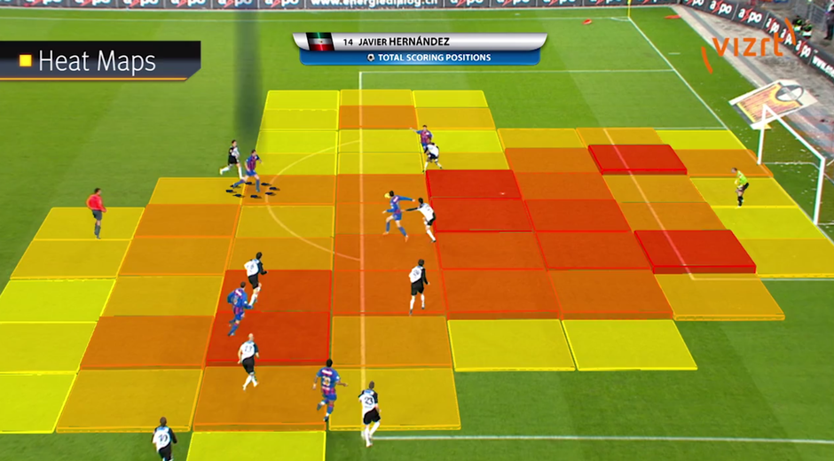
Heatmaps: Used to show patterns in two-dimensional data, such as website click activity or gene expression levels. Heatmaps are effective for spotting hot spots and outliers, but require a clear color scale.
-
Treemaps: Used to show hierarchical data, such as product categories and subcategories. Treemaps efficiently use space and can reveal patterns at multiple levels of granularity.
Of course, this is just a small sample of the hundreds of chart types out there. The key is to match the chart type to the data structure, relationships, and questions at hand.
The Future of Data Visualization: Emerging Trends and Technologies
As data becomes more complex and ubiquitous, the field of data visualization is evolving to keep pace. Here are some of the key trends and technologies that are shaping the future of data viz:
-
Immersive Visualization: Augmented reality (AR) and virtual reality (VR) are opening up new possibilities for interactive, immersive data experiences. Tools like the Virtualitics AI Platform allow users to collaboratively explore 3D visualizations in VR.
-
Real-Time Visualization: As data streams in from IoT sensors, social media, and other real-time sources, visualizations need to update in near real-time to keep pace. Technologies like Apache Kafka and Spark Streaming enable real-time processing and visualization of big data.
-
Automated Insights: AI techniques like natural language generation (NLG) and anomaly detection can automatically surface key insights and narratives from visualizations. Startups like Narrative Science and Automated Insights are pioneering this field.
-
Data Storytelling: As data visualization becomes more ubiquitous, the ability to weave data into compelling narratives is becoming a critical skill. Platforms like Shorthand and Flourish are making it easier for non-technical users to create interactive, data-driven stories.
-
Explainable AI: As machine learning models become more complex and opaque, data visualization is playing a key role in making AI more transparent and interpretable. Techniques like feature importance plots and decision trees can help users understand how models make predictions.
Of course, with these exciting possibilities come new challenges and risks. As Fernanda Viegas and Martin Wattenberg, co-leads of Google‘s PAIR (People + AI Research) initiative, point out:
"As AI becomes more integrated into data visualization tools and processes, it‘s crucial that we design these systems to be transparent, unbiased, and aligned with human values. We need to ensure that AI augments, rather than replaces, human decision making, and that users can understand and trust the recommendations and insights generated by AI."
Conclusion
Data visualization is a powerful tool for exploring, understanding, and communicating insights from data. And as artificial intelligence and machine learning continue to advance, the possibilities for intelligent, automated, and immersive data viz are expanding rapidly.
By staying up to date on the latest tools, techniques, and best practices – and understanding how to effectively harness AI in your data viz workflows – you can create visualizations that are more impactful, efficient, and engaging.
But creating great data visualizations is about more than just tools and technology. It requires a deep understanding of your data, your audience, and the questions you‘re trying to answer. It requires creativity, critical thinking, and a willingness to iterate and improve over time.
As Amanda Cox, former editor of the New York Times‘ data visualization team, puts it:
"Data visualization is not about showing data. It‘s about showing the patterns, the outliers, the things that are surprising or interesting. It‘s about telling stories with data."
So whether you‘re a seasoned data scientist or just getting started with data viz, keep exploring, experimenting, and pushing the boundaries of what‘s possible. The future of data visualization is bright – and with the right tools, techniques, and mindset, you can be a part of shaping it.