Mastering Correlation Metrics: A Data Scientist‘s Guide

Correlation is one of the most ubiquitous concepts in statistics and data science. It‘s a powerful tool for uncovering relationships between variables, which is often the first step in building predictive models or identifying causal connections. However, correlation comes in many flavors, each with its own strengths, limitations, and assumptions.
In this guide, we‘ll take a deep dive into the most common correlation metrics used by data scientists. We‘ll explore when to use each one, how to interpret the results, and what pitfalls to watch out for. By the end, you‘ll be equipped to choose the right correlation technique for your data and draw meaningful insights from the results.
Pearson‘s Correlation Coefficient
Pearson‘s correlation coefficient, often denoted as r, is the most well-known metric for measuring the linear association between two continuous variables. It ranges from -1 to +1, with -1 indicating a perfect negative relationship, +1 a perfect positive relationship, and 0 no linear relationship at all.
The formula for Pearson‘s r is:
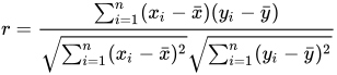
Where x and y are individual data points, x̄ and ȳ are the means of each variable, and sx and sy are the standard deviations.
Pearson‘s r is straightforward to interpret. A coefficient of 0.7 means that for every 1 standard deviation increase in x, y increases by 0.7 standard deviations on average. An r of -0.4 implies that a 1 standard deviation increase in x is associated with a 0.4 standard deviation decrease in y.
However, Pearson‘s r comes with several assumptions and limitations:
-
Linearity: Pearson‘s only measures linear relationships. If the relationship is curved or otherwise non-linear, Pearson‘s can underestimate the strength of the association or even suggest there isn‘t one. Always plot your data first to check for linearity.
-
Outliers: Pearson‘s is sensitive to outliers. A single data point far from the rest can dramatically change the magnitude and even direction of the coefficient. Be sure to screen for and investigate outliers before trusting Pearson‘s.
-
Normality: Pearson‘s assumes both variables are normally distributed. Using it with skewed or heavy-tailed distributions can distort the results. If your data isn‘t normal, consider a non-parametric alternative.
Here‘s an example of calculating Pearson‘s r in Python using the scipy.stats package:
from scipy.stats import pearsonr

x = [1, 2, 3, 4, 5]
y = [2, 4, 6, 8, 10]

corr, p_value = pearsonr(x, y)
print(f"Pearson‘s r: {corr:.3f}, p-value: {p_value:.3f}")
Output:
Pearson‘s r: 1.000, p-value: 0.000In this case, there is a perfect linear relationship between x and y, resulting in a correlation coefficient of 1.
Spearman‘s Rank Correlation Coefficient
Spearman‘s rank correlation coefficient, ρ (rho), is a non-parametric alternative to Pearson‘s. Instead of measuring the linear association between raw values, it assesses the monotonic relationship between ranked values.
To calculate ρ, first convert each variable to ranks, with 1 being the smallest value, 2 the second smallest, and so on. Then apply the same formula as Pearson‘s r but using ranks instead of raw values.
Like Pearson‘s, Spearman‘s ρ ranges from -1 to +1. However, the interpretation is slightly different. A ρ of 0.8 means that as one variable increases, the other variable tends to increase, but not necessarily at a constant rate. The relationship could be linear or curvilinear.
Spearman‘s has several advantages over Pearson‘s:
- Doesn‘t require normally distributed data
- Less sensitive to outliers since it uses ranks
- Can be used with ordinal data
However, it still assumes a monotonic relationship between variables. If the association follows a more complex pattern, Spearman‘s may not detect it.
Here‘s how to find Spearman‘s ρ in Python:
from scipy.stats import spearmanr

x = [1, 2, 3, 4, 5]
y = [2, 1, 4, 5, 3]

corr, p_value = spearmanr(x, y)
print(f"Spearman‘s rho: {corr:.3f}, p-value: {p_value:.3f}")
Output:
Spearman‘s rho: 0.700, p-value: 0.188The ranks of x and y have a strong positive monotonic relationship, but it‘s not quite perfect due to the last pair of values.
Kendall‘s Tau Correlation Coefficient
Kendall‘s tau (τ) is another non-parametric rank correlation metric. It‘s similar to Spearman‘s but with a few key differences:
- It only considers the direction of association between two variables‘ ranks, not the difference in ranks.
- It handles ties in ranks differently. If there are no ties, Kendall‘s and Spearman‘s will be very close. More ties tend to result in lower values of Kendall‘s τ.
To calculate τ:
- Form all possible pairs of observations between the two variables.
- Count the number of concordant pairs (both x and y increase or decrease) and discordant pairs (x increases while y decreases or vice versa).
- Subtract the number of discordant pairs from the number of concordant pairs.
- Divide the result by the total number of pairs.
Kendall‘s τ ranges from -1 (all pairs discordant) to +1 (all pairs concordant). A τ of 0 indicates an equal number of concordant and discordant pairs.
In general, Kendall‘s is more robust than Spearman‘s with smaller sample sizes and more accurate with a large number of tied ranks. It also has a more intuitive interpretation in terms of probabilities of observing concordant and discordant pairs.
Here‘s an example in Python:
from scipy.stats import kendalltau

x = [1, 2, 3, 4, 5]
y = [2, 1, 4, 5, 3]

corr, p_value = kendalltau(x, y)
print(f"Kendall‘s tau: {corr:.3f}, p-value: {p_value:.3f}")
Output:
Kendall‘s tau: 0.400, p-value: 0.327Kendall‘s τ is lower than Spearman‘s ρ for the same data due to the different handling of the last tied rank.
Point-Biserial Correlation Coefficient
The point-biserial correlation coefficient (rpb) measures the association between one continuous variable and one dichotomous (binary) variable. It‘s essentially a special case of Pearson‘s correlation.
To calculate rpb:
- Code the dichotomous variable as 0 and 1.
- Find the means of the continuous variable for each category of the binary variable.
- Calculate the standard deviation of the continuous variable.
- Plug those values into this formula:

Where M1 and M0 are the means of the continuous variable for the two categories, p is the proportion of cases in category 1, and q is the proportion in category 0.
The point-biserial correlation has the same range and general interpretation as Pearson‘s. However, it comes with additional assumptions and limitations:
- The continuous variable should be normally distributed within each category of the dichotomous variable.
- The variances of the continuous variable should be equal across categories.
- Dichotomizing a truly continuous variable will result in lost information.
Here‘s a Python example:
from scipy.stats import pointbiserialr

x = [1, 2, 3, 4, 5]
y = [0, 0, 1, 1, 1]

corr, p_value = pointbiserialr(x, y)
print(f"Point-biserial r: {corr:.3f}, p-value: {p_value:.3f}")
Output:
Point-biserial r: 0.913, p-value: 0.030The high positive rpb indicates that larger values of x are associated with y=1 while smaller values are associated with y=0.
Visualizing Correlations
Calculating correlation coefficients is important, but visualizing your data should always be the first step. Plots can reveal the nature and strength of relationships far better than a single number.
The most common plot for showing correlations is the scatter plot. Each point represents a pair of values, with one variable on the x-axis and the other on the y-axis. The overall pattern of the points indicates the type and strength of the relationship.
Here are some example scatter plots demonstrating different types of correlations:
Heat maps are another useful tool, especially when working with many variables at once. A heat map plots the pairwise correlations between variables in a grid, using color to represent the strength and direction of each relationship.
Here‘s an example heat map of the correlations between various car features:

Darker reds indicate stronger negative correlations, darker blues stronger positive ones, and lighter colors weaker correlations. The diagonal shows each variable‘s perfect correlation with itself.
Correlation vs Causation
Perhaps the most important lesson about correlation is that it does not imply causation. A strong correlation between two variables is a clue that they may be causally related, but it‘s not definitive proof.
There are several ways correlation can be misleading:
-
The association could be pure coincidence. With a large enough dataset, you‘re likely to find some spurious correlations just by random chance.
-
The direction of causation could be reversed. Maybe y causes x instead of the other way around.
-
There could be a confounding variable that causes both x and y, creating the illusion of a direct relationship between them.
-
The relationship between x and y could be mediated by a chain of other variables. Manipulating x might affect y, but only indirectly.
To establish causation, you need to go beyond correlation and use tools like controlled experiments, quasi-experiments, structural equation modeling, or causal inference techniques. These methods attempt to isolate the effect of x on y by accounting for potential confounders and alternative explanations.
Real-World Data Science Examples
Let‘s look at some examples of how different correlation metrics can be used to answer real data science questions.
Pearson‘s r
Suppose you‘re an analyst at an e-commerce company and you want to know if spending more on advertising leads to higher sales. You could calculate Pearson‘s r between daily ad spend and daily revenue. A strong positive correlation would suggest that increasing the ad budget tends to boost sales, though you‘d need to do further analysis to prove causation.
Spearman‘s rho
You‘re researching the relationship between education level and income. Since education is usually measured on an ordinal scale (e.g. high school, bachelor‘s, master‘s, PhD), Spearman‘s rho is a good choice. A high ρ would imply that people with more education tend to earn higher incomes.
Kendall‘s tau
Imagine you‘re studying the association between employee tenure and number of promotions. Many employees are likely to have the same tenure or promotion count, resulting in a large number of ties. In this case, Kendall‘s τ would be more appropriate than Spearman‘s ρ, as it handles ties more effectively.
Point-Biserial
You‘re evaluating the impact of a test prep course and want to see if students who took the course scored higher on the exam. You could use a point-biserial correlation between course completion (0 = didn‘t complete, 1 = completed) and exam score. A significant positive rpb would indicate that course takers tend to outperform non-takers.
Partial Correlation
Let‘s say you‘re investigating the relationship between physical exercise and blood pressure. However, you know that age affects both exercise habits and blood pressure. To isolate the unique association between exercise and blood pressure, you could calculate the partial correlation between them while controlling for age.
Conclusion
Correlation is a versatile tool for exploring relationships in data, but it‘s crucial to understand the assumptions and limitations of each metric. Choosing the wrong correlation coefficient or over-interpreting the results can lead to faulty conclusions and poor decisions.
Remember, correlation is not causation. A strong correlation is a hint that two variables might be causally related, but it‘s not proof. Always think critically about potential confounders and alternative explanations before concluding that x causes y.
By mastering the different types of correlation and their proper use cases, you‘ll be well-equipped to uncover meaningful insights from your data. Just be sure to visualize your data, check assumptions, and think beyond correlation to get the full picture.