The Power of Dynamic Dashboards: A Guide to Building Interactive Data Visualizations with Google Data Studio
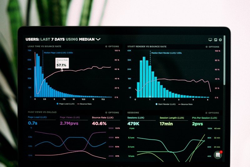
In the era of big data, organizations are drowning in information. According to a 2020 report from DOMO, over 2.5 quintillion bytes of data are created every single day, and this volume is only expected to grow (DOMO, 2020). Static spreadsheets and canned reports are no longer sufficient to navigate this deluge. To transform raw data into actionable business intelligence, organizations need tools that surface insights in real-time and enable interactive exploration. Enter dynamic dashboards.
Dynamic dashboards are automated, data-driven visualizations that update in real-time as underlying data changes. Rather than a static snapshot, dynamic dashboards provide a live window into the pulse of your business. By connecting directly to databases, web services, and other sources of data, these dashboards reflect the most up-to-date information and allow users to ask and answer questions in the moment.
The Business Value of Dynamic Dashboards
The value of dynamic dashboards lies in their ability to democratize data and analytics across the enterprise. By packaging key metrics and insights in an intuitive, interactive format, dashboards empower users of all skill levels to monitor performance, spot anomalies, and make data-driven decisions.
Consider these statistics on the business impact of data dashboards:
- 48% of businesses say implementing dashboards has significantly improved their decision making (Driessen, 2020)
- Dashboards and advanced visualization lead to 28% better sales, on average (Juice Analytics, 2009)
- Organizations that adopt real-time business intelligence solutions see an average 20% increase in revenues (Aberdeen Group, 2014)
Furthermore, dynamic dashboards help break down data silos between departments. With a centralized, constantly updating single source of truth, everyone from executives to frontline workers are aligned around the same KPIs and metrics. This enables organizations to be more agile, collaborative, and responsive to changing business conditions.
Google Data Studio: A Powerful Platform for Dynamic Dashboarding
One of the leading tools for building dynamic dashboards is Google Data Studio. Launched in 2016, Data Studio is a free, web-based platform that enables users to visualize data from a variety of sources, create custom reports and dashboards, and share insights across their organization.
Some of the key features and capabilities of Data Studio include:
-
Easy data connectivity: Data Studio supports seamless connections to over 500 data sources, including Google Analytics, Google Ads, BigQuery, MySQL, PostgreSQL, CSV files, and more. This allows you to bring all your data together in one place for a unified view.
-
Drag-and-drop report builder: With Data Studio‘s intuitive report builder, users can create beautiful, interactive dashboards without writing a single line of code. Simply select the charts, tables, and visualizations you want to use, style them with colors and fonts, and arrange them on the canvas.
-
Real-time data and collaboration: Data Studio reports and dashboards automatically update whenever the underlying data changes, ensuring users always see the most current information. Multiple users can work together on a report in real-time, and dashboards can be easily shared via links or embedded in websites and apps.
-
Custom formulas and calculated fields: For more advanced use cases, Data Studio supports custom formulas and calculated fields using SQL-like syntax. This enables users to transform and manipulate raw data directly within the platform.
-
Powerful data controls: Data Studio provides granular control over how data is accessed and displayed. Users can define data refresh schedules, set up report-level and user-level filters, and manage sharing and access permissions.
According to a 2021 report from Datapine, Google Data Studio is now the second most popular business intelligence and data visualization tool, behind only Tableau (Datapine, 2021). Its ease of use, broad connectivity, and powerful sharing and collaboration features make it an ideal choice for organizations looking to implement dynamic dashboards at scale.
Building a Dynamic Dashboard in Google Data Studio
So what does the process of building a dynamic dashboard in Data Studio actually look like? Let‘s walk through a simple example step-by-step.
Suppose you work for an e-commerce company and want to create a dashboard to track key sales and marketing metrics. Here‘s how you would build it in Data Studio:
-
Connect your data sources: First, you need to connect Data Studio to the sources of data you want to visualize. In this case, let‘s say you want to pull in data from Google Analytics (to track website traffic and conversions) and from your internal sales database (to track revenue and order volume).
To connect these sources, click the "Create" button in Data Studio and select "Data Source". Choose the connector type (Google Analytics, MySQL, etc.), enter your credentials, and select the specific data fields you want to import.
-
Create a new report: Once your data sources are connected, it‘s time to start building your dashboard. Click the "Create" button again and select "Report". This will open up a blank canvas where you can start adding charts and visualizations.
-
Add charts and visualizations: To add a chart, simply click the "Add a Chart" button in the toolbar and select the type of visualization you want (bar chart, line graph, table, etc.). In the data panel, select the specific metrics and dimensions you want to visualize.
For example, to create a line graph of daily website users over the past 30 days, you would select "Sessions" as your metric and "Date" as your dimension. You can further customize the chart by adding a title, changing colors and fonts, and applying filters.
Repeat this process to add more charts for your key metrics, such as:
- Monthly revenue and orders
- Top products by sales volume
- Website conversion rate
- Acquisition channels (organic search, paid search, email, etc.)
-
Add interactive controls: To make your dashboard dynamic and interactive, add controls that allow users to filter and segment the data. The most common controls are date range pickers and drop-down filters.
For example, you could add a date range picker that allows users to zoom in on a specific time period, and a drop-down filter that allows them to view metrics for a particular product category or marketing channel.
-
Style and arrange your dashboard: Once you have all your charts and controls in place, it‘s time to make your dashboard visually appealing and easy to navigate. Use Data Studio‘s formatting tools to add headers, colors, and branding that align with your corporate style guide. Arrange the charts on the page in a logical order, with the most important metrics prominently displayed.
-
Share and embed your dashboard: Finally, it‘s time to share your dynamic dashboard with your stakeholders. Data Studio makes it easy to share reports via links or to schedule automatic email delivery. You can also embed your dashboard in websites, intranets, or custom apps for wider distribution.
Here‘s a sample dynamic dashboard that demonstrates the final output:

This dashboard provides an at-a-glance view of key e-commerce metrics with interactive controls to filter by date range and product category. As new sales data flows in, the charts and tables will automatically update to reflect the latest figures.
Real-World Examples and Use Cases
Dynamic dashboards built with Google Data Studio have endless applications across industries and business functions. Here are just a few real-world examples:
-
Marketing Dashboard: Google showcases a dynamic marketing dashboard that visualizes data from Google Analytics, Google Ads, DoubleClick, and YouTube. Marketers can use this dashboard to track KPIs like impressions, clickthrough rate, and ROI across channels.
-
Financial Reporting Dashboard: This dashboard from the Data Studio Report Gallery demonstrates how financial metrics like revenue, profit and loss, and cash flow can be dynamically visualized. The CFO can use this real-time view to monitor the financial health of the organization.
-
Supply Chain Dashboard: Logistics company Transplace uses Data Studio dashboards to track on-time delivery percentages, carrier performance, and transportation costs across its network. These interactive dashboards help Transplace optimize routes and improve operational efficiency.
-
Healthcare Dashboard: This hospital performance dashboard shows how dynamic dashboarding can be applied in a healthcare context. Hospital administrators can monitor metrics like patient volume, length of stay, and readmission rates and slice the data by facility and department.
As these examples illustrate, dynamic dashboards built with Google Data Studio can provide transformative business intelligence to organizations of all types and sizes. By surfacing key metrics in real-time and allowing users to interactively explore data, these dashboards enable smarter, faster decision-making.
Perspective: The Future of Dynamic Dashboards
Looking ahead, the demand for and capabilities of dynamic dashboards will only continue to grow. As organizations become increasingly data-driven, there will be pressure to deliver insights to more people, on more devices, in real-time. At the same time, advances in artificial intelligence, machine learning, and natural language processing will make dashboards more intelligent and intuitive.
Gartner predicts that by 2025, data stories will be the most widespread way of consuming analytics, and 75% of stories will be automatically generated using augmented analytics techniques (Gartner, 2021). We‘re already seeing hints of this future in Google Data Studio, with features like Google Analytics Insights which uses machine learning to automatically surface relevant data points and trends.
Other emerging capabilities that will shape the future of dynamic dashboards include:
- Predictive and prescriptive analytics: Dashboards that not only visualize historical data, but predict future outcomes and recommend optimal courses of action.
- Conversational interfaces: The ability to query and interact with dashboards using natural language, making insights accessible to a wider audience.
- Augmented and virtual reality: Immersive, multi-dimensional data environments that users can explore and manipulate in intuitive ways.
Of course, with great power comes great responsibility. As data dashboards become more ubiquitous and influential, organizations will need to be vigilant about data quality, governance, and security. Dashboards are only as good as the data that feeds them, so it‘s critical to have robust processes in place to ensure accuracy, consistency, and compliance.
"Data visualization is both an art and a science. The art is in the design and the aesthetics that engage the user. The science is in the data and the statistics that inform the insights." – Noa Ganot, Product Manager at Google Data Studio (Ganot, 2020)
In conclusion, dynamic dashboards are a powerful tool for harnessing the explosion of data in the modern enterprise. By providing an interactive, real-time window into business performance, dashboards built with platforms like Google Data Studio enable organizations to make smarter decisions, faster. As data continues to grow in volume and complexity, the organizations that will thrive are those that can effectively democratize data, derive insights at scale, and use those insights to drive continuous improvement. That‘s the true power of dynamic dashboards.
References
- Aberdeen Group. (2014). Real-Time Data: The Key to Unlocking Customer Insights.
- Datapine. (2021). 16 Business Intelligence Trends and Predictions for 2021/2022.
- DOMO. (2020). Data Never Sleeps 8.0.
- Driessen, S. (2020). 16 Powerful Business Dashboard Examples & Templates. Datapine.
- Ganot, N. (2020). Data Visualization: The Art and Science of Dashboards. Google Data Studio Blog.
- Gartner. (2021). Top Trends in Data and Analytics for 2021.
- Juice Analytics. (2009). Advanced Visualization Helps Organizations Make Better Decisions Using Business Intelligence.