10 Expert Tips for Creating Winning Dashboards in Qlik
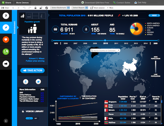
Dashboards have become ubiquitous in modern business—a 2020 Dresner Advisory Services report found that 88% of companies rated dashboards as critically or very important. A well-designed dashboard provides at-a-glance insights, highlights trends, and guides data-driven action.
However, not all dashboards are created equal. Cluttered, confusing, or misaligned dashboards can do more harm than good, leading to incorrect assumptions and poor decisions. As data volumes grow and business needs evolve, designing dashboards has become both an art and science.
Qlik, a leader in the business intelligence space, provides a robust platform for creating interactive, AI-powered dashboards. Qlik‘s associative model, powerful visualizations, and augmented analytics make it a top choice for organizations looking to democratize data and drive decision-making.
But with great dashboard power comes great responsibility. As a Qlik developer or dashboard designer, you must wield Qlik‘s tools strategically to create dashboards that inform and inspire. Here are 10 expert tips, insights, and best practices to help you create winning dashboards in Qlik.
1. Begin with the end in mind
One of Stephen Covey‘s "7 Habits of Highly Effective People" is "begin with the end in mind." This principle is critical for dashboard design.
Before building anything in Qlik, clarify:
- What is the purpose of this dashboard?
- Who will be using it?
- What decisions should it drive?
- What key metrics matter most?
Collaborate with stakeholders and end users to identify their must-have metrics and analytics needs. Sketch out a wireframe or prototype to align on content and layout.
Starting with a clear vision will keep your Qlik development focused and ensure the final product delivers maximum impact for your specific audience. A sales dashboard for a CEO will look very different than an inventory dashboard for warehouse managers—tailor accordingly.
2. Plan your data model thoughtfully
Qlik‘s associative data model is one of its standout features—it allows mashups of data across sources without predefined drill paths. This provides incredible flexibility, but also requires thoughtful modeling.
Consider how users will want to slice and analyze the data. Integrate data from key source systems, but avoid the kitchen sink approach—too much irrelevant data will bog down performance. Apply transforms and calculations in the data load editor to optimize for analysis.
Consult Qlik‘s data modeling best practices, including using star schemas, resolving circular references, and compressing synthetic keys. A clean, thoughtful data model will empower your dashboards.
3. Choose charts strategically
Research shows that choosing the right chart type can dramatically impact users‘ understanding and the speed at which they grasp insights. Qlik offers dozens of visualizations—your job is to pick the right one for the data and message.
Some guidelines:
- Use bar charts for categorical comparisons
- Line charts show trends over time
- Scatter plots visualize distribution and correlation
- Pie charts convey part-to-whole relationships
- Gauges track progress to goal
- Maps plot geographic patterns
The Qlik chart suggestion engine recommends optimized chart types based on your data‘s properties—use it as a starting point. Consider the gestalt principles and preattentive attributes to draw users‘ attention to what matters most.
4. Guide with color
The human brain processes color preattentively, before consciously focusing attention. Thus, color is one of your most powerful tools for highlighting insights and guiding the user through your dashboard‘s story.
Use a unified color palette with 5-6 colors max. Leverage natural associations—green for good, red for bad, etc. Employ bright, saturated colors for key insights, paler hues for less important data.
Avoid overuse of color—too many hues will create visual clutter. Balance color with white space to create a clean, focused interface. Ensure sufficient contrast between colors for colorblind users.
5. Make every pixel earn its place
Real estate is limited on dashboards—make every pixel earn its place. Every chart, filter, and design element should support the dashboard‘s primary goal.
Eliminate "chartjunk"—visual embellishments that serve no informational purpose. Edward Tufte recommends maximizing the data-ink ratio, the proportion of pixels used to present actual data vs. decorative elements.
Combine related metrics in a single chart rather than multiple. For instance, show target and actual in one gauge, rather than two side-by-side. Employ progressive disclosure to declutter—hide granular details behind tooltips or drill-downs.
6. Add meaningful interactivity
Static dashboards are boring—meaningful interaction engages users and facilitates insight discovery. Qlik‘s associative model empowers freeform exploration without predefined drill paths.
Look for opportunities to add interactivity relevant to the users‘ goals:
- Tooltips to see details on hover
- Drill-downs to go from summary to transaction level
- Filters and sliders to narrow focus
- Custom actions triggered on click/tap
Qlik‘s Cognitive Engine provides additional ways to interact via search and natural language. Users can type a query like "sales by product last quarter" and instantly get an auto-generated chart.
7. Leverage AI-powered insights
AI and machine learning are transforming business intelligence—Gartner predicts augmented analytics will be ubiquitous in the coming years. Qlik is leading this charge with their Insight Advisor.
Insight Advisor automatically surfaces key insights as users explore, generated by Qlik‘s Cognitive Engine. It detects trends, correlations, outliers, and comparisons users might have overlooked.
Augmented analytics doesn‘t just enhance the user experience—it fundamentally changes how dashboards are developed. With AI suggesting insights, dashboard designers can focus on intuitive flow and data storytelling vs. manual chart configuration.
8. Design for specific devices
Gone are the days of designing solely for desktop monitors—mobile business intelligence adoption nearly doubled from 2016 to 2020. Dashboards must be optimized for phones and tablets too.
Designing mobile dashboards requires a different approach:
- Prioritize essential metrics for smaller screen
- Use vertical layouts aligned with phone scroll direction
- Enlarge buttons and touch targets for fingers
- Provide clear labels since hover interactions are limited
Qlik dashboards can use responsive design and progressive disclosure to dynamically adapt layouts to screen size. Plan distinct layouts for desktop, tablet, and phone form factors from the start.
9. Prototype, test, iterate
Like any good design, dashboards are iterative—you won‘t nail it on the first try. Rapid prototyping and frequent user testing are key to creating intuitive, high-impact dashboards.
Prototype early and often. Share mockups with end users to gather feedback on metrics, interactions, and flow. Test live dashboards to see how people actually navigate and use filters. Observe where they get stuck or ask questions.
Based on feedback, make iterative improvements. Release updates in phases to maintain momentum. Treat dashboards as evolving assets to be continually enhanced, not one-off projects.
10. Learn from the community
You‘re not alone on your quest for killer dashboards—there‘s a vibrant Qlik community sharing knowledge. Qlik Community has forums, groups, webinars, and blogs on all things Qlik.
Explore the Qlik Branch open source library for inspiration and free extensions. Check out Qlik Demo Apps to see best practices in action. Follow dashboard experts like Patrik Lundblad, Agneta Hansson, and Elif Tutuk for tips and tricks.
Of course, the ultimate inspiration is real-world examples. Browse past Qlik Luminary Award nominees to see how organizations across industries are using Qlik. Reach out to other Qlik developers to swap ideas and best practices. Tap into the hive mind!
Closing thoughts
Dashboard design is both art and science. An effective dashboard must be visually compelling, ruthlessly focused, flexible yet guided, and tailored to its audience. It‘s a challenge to be sure, but the impact is massive—transforming raw data into actionable insights.
By leveraging Qlik‘s robust capabilities and following these tried-and-true tips from the trenches, you‘ll be well equipped to create dashboards that dazzle and deliver. Now go make some magic!