
World Under Water: What a Lost Climate Website Still Teaches Us
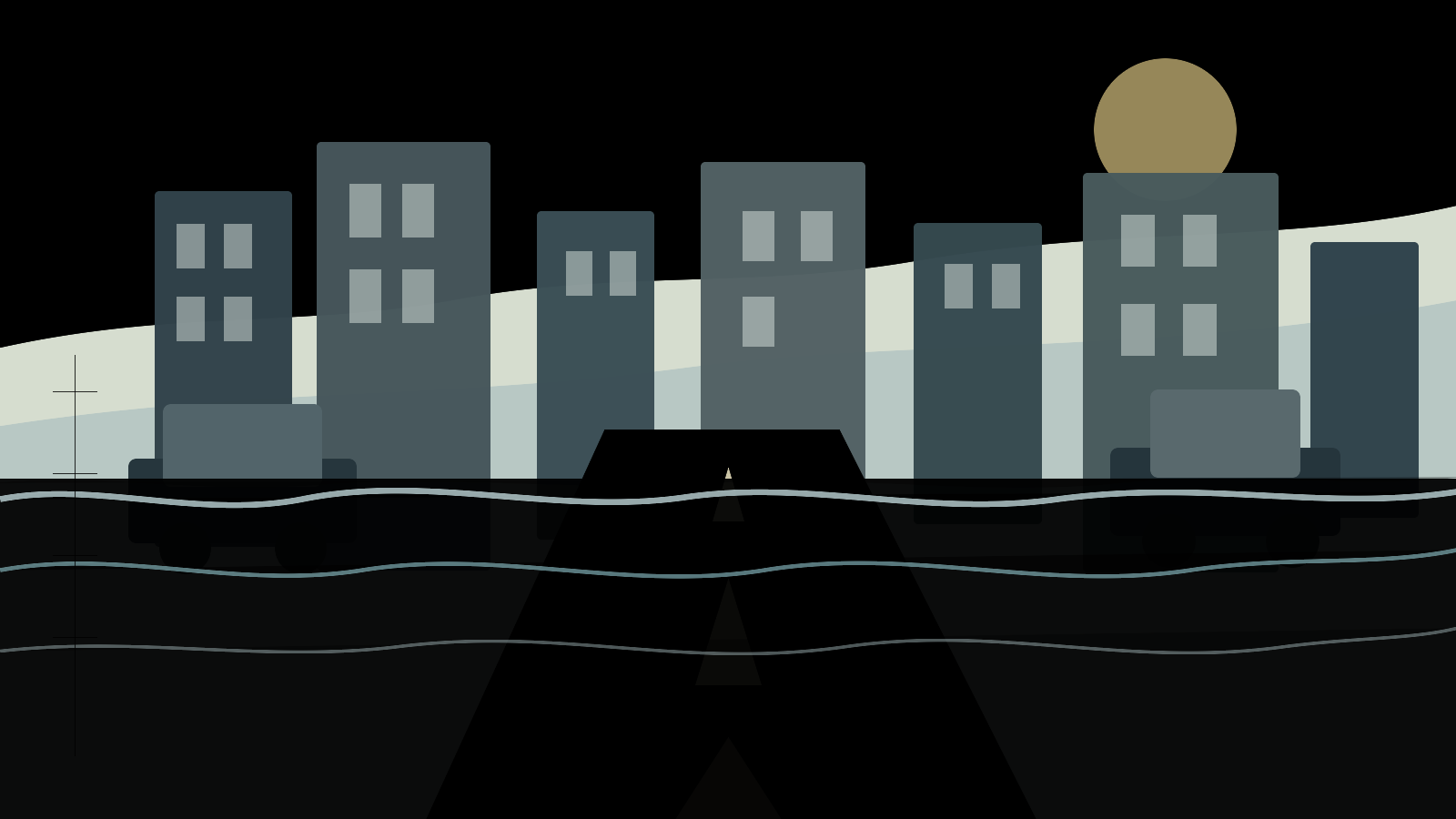
The phrase world under water once had a strangely literal life online. For people who found WorldUnderWater.org in 2014, the experience was not a chart, a report, or a policy memo. It was the simple act of typing an address into a browser and seeing a familiar street covered by water. A front door, a school route, an office block, a corner store, or a landmark suddenly appeared as part of a climate future that usually felt abstract.
That was the genius of the old project. It understood that climate change often fails to move people when it arrives as a planetary average. A global temperature anomaly, a sea-level graph, or a projection to 2100 can be scientifically essential and emotionally distant at the same time. WorldUnderWater.org tried to close that distance. It used the visual grammar of Google Street View, which many people already trusted as a way to recognize real places, and added an impossible layer: water where the road should be.
The site is gone as a working public tool. What remains is a set of archived traces: a Wayback Machine snapshot from May 8, 2014, award records, design writeups, and memories from people who saw it circulate. That is enough to reconstruct what it was, but not enough to treat it as a scientific flood model. That distinction matters. The original World Under Water experience was a climate-communication project. It made sea-level rise feel personal. It did not tell a homeowner, renter, planner, or city engineer exactly how deep the water would be at a specific address.
The deeper lesson is more durable than the old interface. Sea-level rise is real. It is measurable. It is uneven. It is already changing coastal flood risk. But the future is not a single movie in which the whole world goes underwater at once. The danger is slower, more local, and in many places more complicated: higher high tides, heavier storm impacts, subsiding land, failing drainage, saltwater in places it did not used to reach, roads that flood on days without rain, and public costs that arrive long before a map turns blue.
That is why a redirected visitor looking for worldunderwater.org deserves more than a nostalgic note. The old site asked people to imagine water at their doorstep. Today, the best answer is to explain what that image got right, what it simplified, and what current sea-level science says about the choices still in front of us.
What Was WorldUnderWater.org?
WorldUnderWater.org was a 2014 interactive climate campaign associated with CarbonStory and BBDO Proximity Singapore. The One Club archive for World Under Water lists the client as CarbonStory LLP, the agency as BBDO Proximity Singapore, and the work as a 2015 One Show Interactive entry in the public service and nonprofit website category. The same award record describes the experience as a warning sign that combined WebGL and Google Street View to show streets familiar to the user as if they were suddenly underwater.
The archived homepage is sparse because the original site depended heavily on browser-side technology, maps, and media assets that do not fully survive in a simple text capture. Still, the May 2014 snapshot shows the CarbonStory attribution, a “Take action” prompt, links to calculate emissions, offset a carbon footprint, and support green projects, plus a WebGL warning for browsers that could not run the experience. Those fragments match the campaign record: the point was not only to shock users with flooded streets, but to push them toward carbon-footprint awareness and climate-project support.
In practical terms, the project belonged to a period when the web was discovering how powerful mapped, personalized visuals could be. Google Street View had already trained users to expect that an online map could become a familiar street-level scene. WebGL made it possible to add more ambitious visual effects inside a browser. The campaign joined those technologies to a climate message: instead of asking people to imagine sea-level rise from a diagram, it asked them to search for a place they knew.
That detail matters. Many climate campaigns show polar ice, smokestacks, dry landscapes, or aerial photos of disasters. Those images can be true and still feel far away. WorldUnderWater.org used a different route. It said, in effect: start with your own mental map. Start with a street that already means something to you. Then imagine water intruding into that ordinary scene.
That made the site memorable, but it also made it easy to misunderstand. A Street View flood scene can feel like a prediction because it has the texture of a real location. The road markings, building facades, parked cars, and shopfronts make the image feel specific. But the flood layer was an illustrative device. It was not a parcel-level model of elevation, storm surge, drainage, flood defenses, vertical land movement, future emissions, or local adaptation. Its claim was emotional and rhetorical: climate risk is not confined to faraway ice. Its claim was not: this exact address will flood to this exact depth on this exact date.
That is the frame in which the old project should be remembered. It was a clever, serious act of Google Street View climate change communication. It used a browser illusion to make a public problem visible at human scale.
Why It Worked
The old World Under Water idea worked because it solved one of the hardest problems in climate communication: scale. Climate change is too large for ordinary intuition. It happens through atmospheric chemistry, ocean heat, ice dynamics, infrastructure decisions, land use, and politics. Its signals can unfold over decades. Its worst risks are often described in global averages, probability ranges, and future scenarios. Those are the right tools for science, but they are not always the right tools for attention.
People understand risk differently when it has a location. A phrase like “global mean sea level” is accurate, but it does not tell the body what to feel. A flooded image of a route to work does. The old site translated a global process into the language of place. That does not make the image more scientifically precise. It makes the issue harder to dismiss.
There is also a social reason it spread. A personalized visualization is shareable in a way a report table is not. Users could look up a famous landmark, a hometown street, or a place connected to a friend. The experience invited comparison: what would this city look like, what would my block look like, what would a famous avenue look like? That made the campaign a conversation object. It turned climate change flooding from a phrase into a scene that people could pass around.
The stronger psychological move was that it disrupted the ordinary status of Street View itself. Street View is usually a tool of confirmation. It tells you what a place looks like, where the entrance is, whether the street is narrow, what the corner looks like before you arrive. WorldUnderWater.org borrowed that trust and bent it. The familiar interface no longer confirmed the present. It suggested a possible future.
That is why the project still matters even after the original website stopped working. The best climate communication does not replace science. It creates a reason to seek science out. A person who sees a graph may ask whether it is relevant to their life. A person who sees their own street underwater may ask a more urgent question: how could something like that happen, and what does the evidence actually say?
But the same emotional power creates responsibility. Personalized images can make people pay attention, but they can also overstate certainty if they are not explained. A flood visualization attached to a real address can blur the line between “this is a warning about risk” and “this is a forecast for this property.” That line is where WorldUnderWater.org is most useful as a case study. It shows both the promise and the hazard of making climate change personal.
What the World Under Water Idea Got Right and Wrong
The old site got one big thing right: climate risk becomes more meaningful when people can connect it to the places they know. Sea-level rise is not only an environmental issue for remote coastlines. It affects housing, transportation, insurance, public budgets, emergency planning, drinking water, wastewater systems, ports, ecosystems, and cultural places. A city does not have to disappear beneath the ocean for water to change daily life. A few extra inches can make a high tide reach a road more often. A storm riding on higher baseline water can travel farther inland. A drainage system designed for the last century can fail more often in this one.
The site also got right the idea that sea-level rise is tied to human choices. It linked the visual shock to CarbonStory's action prompts around emissions and climate projects. Not every action pathway from that era looks adequate today, and individual carbon offsets are not a substitute for structural policy. Still, the basic connection was sound: the amount of future warming and long-term sea-level commitment depends on emissions, energy systems, land use, planning, and adaptation.
Where the project could mislead is precision. A flooded Street View scene is visually specific, but the old campaign was not a local engineering assessment. It did not appear to calculate the elevation of every doorstep, the protection offered by levees or seawalls, the effect of local subsidence, the return period of storms, or the timing of different emissions pathways. It also did not distinguish between permanent inundation, nuisance flooding, tidal flooding, storm surge, rainfall-driven flooding, groundwater rise, and drainage backup. In real planning, those distinctions are not academic. They decide what kind of risk a community faces and what response makes sense.
There is another subtle problem with the phrase “world under water.” Taken literally, it is wrong. Sea-level rise will not put the entire world under the ocean. Most land is not low-lying coast. Many inland places face different climate risks: heat, drought, wildfire, water stress, crop disruption, or intense rainfall. Even along coastlines, sea-level rise is not uniform. Some places rise relative to the sea because land is rebounding or tectonics are lifting it. Other places sink because of groundwater withdrawal, sediment compaction, or natural subsidence. Some coastlines face unusually high relative sea-level rise; others face less than the global average.
But as a metaphor, “world under water” still has force. It describes a world in which water crosses more thresholds: the curb, the subway entrance, the port road, the septic system, the wetland edge, the insurance line, the public budget, the boundary between a rare emergency and a recurring condition. The danger is not that every place becomes Atlantis. The danger is that the edges of the built world were drawn for a shoreline that is no longer stable.
So the fair reading is this: WorldUnderWater.org was not a precise flood model and should not be treated as a property-level flood prediction. It was a warning image. It told an emotional truth before explaining the scientific details. Our job now is to keep the emotional truth while being clearer about the details.
That same caution applies to many modern climate visuals. A map can be useful without being complete. A blue overlay can show exposure without showing building elevation, floodproofing, drainage, warning time, evacuation access, insurance coverage, or social vulnerability. A scenario can show what happens under a set of assumptions without saying that outcome is guaranteed. A dramatic image can open the door, but readers still need to ask what data sits behind it, what year or emissions pathway it assumes, whether the map represents mean higher high water or a storm event, and whether it accounts for local land movement.
This is not a reason to avoid visualization. It is a reason to label it honestly. The strongest climate tools help people move from recognition to understanding. They show a place, but they also explain uncertainty. They name the difference between permanent inundation and temporary flooding. They distinguish a global trend from a local outcome. They help a resident understand why the same amount of sea-level rise may mean one thing for a sandy barrier island, another for a subsiding delta, and another for a dense city with pumps, seawalls, tunnels, and old combined sewers.
What Has Changed Since 2014
The science of sea-level rise did not begin in 2014, but the public evidence base has become more visible since then. Satellite measurements, tide-gauge records, ice-sheet observations, ocean-temperature data, and improved regional projections now give planners and the public a clearer picture than a single campaign website could provide.
The IPCC Sixth Assessment Report Synthesis Summary for Policymakers, published in 2023, states that global mean sea level increased by 0.20 meters between 1901 and 2018, with the rate rising across the record. The IPCC gives average rates of 1.3 millimeters per year for 1901-1971, 1.9 millimeters per year for 1971-2006, and 3.7 millimeters per year for 2006-2018. Those numbers are not campaign metaphors. They are the assessed summary of a century-scale physical change.
NASA's public indicators tell the same broad story in a more frequently updated way. The NASA Sea Level Earth Indicator listed a latest measurement of 95.8 millimeters, plus or minus 4.0 millimeters, for April 2026 when this article was prepared. NASA also explains that satellite measurements show global sea level has risen by roughly 3.6 inches, or 91 millimeters, since 1993. The NASA Sea Level Change Portal reports that the annual rate of rise has increased from about 0.20 centimeters per year in 1993 to about 0.44 centimeters per year in the current record.
Those details matter because they show acceleration. A rising sea is not only higher than it used to be. The pace of rise has increased during the satellite era. NASA's January 29, 2026 analysis of 2025 sea level noted that a mild La Nina temporarily slowed the annual rise that year, but the same analysis emphasized that the multi-decade rate has more than doubled since the early 1990s and that the average global sea level has gone up by about 4 inches, or 10 centimeters, since 1993. Short-term wiggles do not erase the long-term trend.
For the United States, the 2022 Sea Level Rise Technical Report resource page summarizes a multi-agency finding from NOAA and federal partners: sea level along the U.S. coastline is projected to rise 10 to 12 inches over the next 30 years, and flooding is expected to occur more than 10 times as often on average over that same period. A related U.S. Climate Resilience Toolkit sea-level-rise overview explains that U.S. regional changes vary, with larger anticipated rise by 2050 along the Gulf Coast than along the West Coast.
That last point is essential. A global mean is a baseline, not a local forecast. A coastal community needs to know both the global trend and the local relative sea level: the height of the sea compared with the land at that place. A neighborhood built on compacting delta sediment is not in the same position as a rocky coast that is rising. A city with stormwater systems at sea level is not in the same position as a city whose critical infrastructure is set farther inland or higher above the tide. Since 2014, tools for exploring those differences have become more accessible, but the differences themselves have always been part of the risk.
What has also changed is the policy conversation. In 2014, many public climate visuals still framed sea-level rise mostly as a future danger. Today, many coastal places are already planning for higher water, repetitive flooding, saltwater intrusion, wetland migration, infrastructure elevation, buyouts, and managed retreat. The future is still uncertain in its exact shape, especially at high warming levels and long time horizons. But the direction of travel is no longer a speculative idea.
There is a cultural change, too. Sea-level rise is no longer discussed only through end-of-century maps. It is increasingly discussed through mortgage terms, infrastructure lifetimes, bond ratings, insurance withdrawals, port investments, school locations, and whether a road built today will still function in 2050. That shorter horizon is important. A homeowner may not plan around 2150, but a bridge, wastewater plant, hospital, port terminal, or public housing complex can easily have a design life that extends into decades of additional rise.
How a World Goes Under Water
A world does not go under water by magic. It happens through physical processes that add water to the ocean, expand the water already there, alter land height, and amplify extremes.
The first process is thermal expansion. Water expands as it warms. Because the ocean has absorbed a large amount of excess heat trapped by greenhouse gases, warmer seawater takes up more volume. That expansion raises sea level even if no ice melts. NASA's sea-level pages describe this as one of the two primary drivers of global sea-level rise.
The second process is land ice melt. When glaciers and ice sheets on land lose mass, water that was stored on land moves into the ocean. Mountain glaciers, Greenland, and Antarctica all matter, though they operate on different scales and timelines. NASA's Earth Indicator states that current global sea-level rise is caused mostly by melting land ice, with ocean warming also contributing. The IPCC adds a long-term warning: sea-level rise is unavoidable for centuries to millennia because deep ocean warming and ice-sheet melt respond slowly, but deep and sustained emissions reductions can limit further acceleration and long-term commitment.
The third process is local land movement. This is why a global average can be misleading at street scale. If land sinks, relative sea level rises faster. Land can sink because of groundwater pumping, oil and gas extraction, sediment compaction, tectonics, or the natural behavior of delta soils. If land rises, relative sea level can rise more slowly or even appear to fall locally. The U.S. Climate Resilience Toolkit notes both sides of this pattern: some regions experience falling local sea level where land is rising faster than the ocean, while subsiding regions can experience faster relative rise than the global average.
The fourth process is storm surge and wave action. Sea-level rise lifts the starting line for coastal storms. A storm that would once have produced serious but contained flooding may ride on a higher base and reach farther inland. That is one reason sea-level rise can increase damages before permanent inundation occurs. The same storm on a higher ocean is not the same storm for a coastal road, subway portal, port, hospital, or wastewater plant.
The fifth process is tides. Tides are normal, but higher baseline water changes their consequences. Many coastal communities now worry about high-tide flooding, sometimes called sunny-day flooding, because streets can flood even without rain or a named storm. When the ordinary high tide crosses a threshold more often, the lived experience of climate change changes. The problem becomes calendars, commutes, corrosion, emergency access, and repeated cleanup, not only rare disasters.
The sixth process is rainfall and drainage interaction. WorldUnderWater.org's image focused on water coming from the sea, but many real flood events are compound events. Heavy rain can arrive when a high tide blocks drainage. A storm surge can push into outfalls. Groundwater can rise from below. Urban pavement can speed runoff. Old pipes can be undersized for new rainfall patterns. A street can be “under water” because the ocean, the sky, and the drainage system are all interacting.
Put those processes together and the simple image becomes more nuanced. Climate change flooding is not one blue layer painted over a map. It is a stack of changing probabilities. It is mean sea level, local land motion, tides, storms, rainfall, groundwater, infrastructure, and decisions about where and how to build. That complexity does not make the risk less serious. It makes local planning more important.
It also changes the meaning of time. Sea-level rise can feel slow when described in millimeters per year, but infrastructure fails at thresholds. A curb is overtopped or it is not. A pump station has capacity or it does not. Saltwater reaches a freshwater intake or it does not. A mortgage, bond, insurance policy, or public works schedule may cross its own threshold before the physical landscape looks transformed. That is why the most important impacts can appear first as administrative and financial stress: more closures, more maintenance, higher premiums, harder borrowing, and public arguments over who should pay.
The Inequality of Water
Water does not rise into a socially equal world. The same physical height can have very different consequences depending on wealth, infrastructure, governance, land rights, insurance, mobility, and political power.
Low-lying deltas are a clear example. Deltas often combine fertile land, dense settlement, ports, fisheries, transport corridors, and subsiding sediment. They can be economically vital and physically fragile at the same time. A few additional inches of relative sea-level rise can worsen storm surge, salinity, erosion, and drainage problems. If millions of people depend on a delta, the risk is not just shoreline loss. It is food systems, migration pressure, water quality, housing, and public finance.
Small islands face another version of the problem. For some islands, the issue is not only land area but freshwater lenses, roads, airports, schools, burial grounds, and cultural continuity. A place can become harder to inhabit before it is fully underwater. Saltwater intrusion into freshwater, repeated storm damage, and rising maintenance costs can make the future feel narrower even while homes still stand.
Informal settlements and low-income neighborhoods often carry disproportionate risk because they are more likely to be located on marginal land, near industrial waterfronts, beside drainage channels, or outside the reach of strong protective infrastructure. Residents may have less access to insurance, savings, legal assistance, relocation support, or political influence. When floods come, recovery is not only a matter of water depth. It is a matter of who can miss work, replace documents, repair a home, pay rent during displacement, and persuade authorities to invest.
Wealthy coastal property is also exposed, but wealth changes the options. A high-value shoreline community may be able to elevate buildings, build defenses, lobby for beach nourishment, or absorb insurance costs longer than poorer places. That does not make the risk imaginary. It means public choices about protection can easily become choices about whose assets deserve defending. If adaptation money follows property value alone, sea-level planning can deepen inequality.
Ports and industrial waterfronts add another layer. Many ports sit precisely where sea-level rise matters: at the edge between land transport and ocean shipping. They support jobs and supply chains far beyond the waterfront. Flooding a port road or electrical system can have consequences that ripple inland. The same is true for wastewater plants, power substations, tunnels, hospitals, and fuel storage sites built near the water because that location once made engineering or economic sense.
This is where the old World Under Water image becomes morally useful. It asks viewers to care about place. The next step is to ask which places have been made vulnerable, which communities are heard in planning, and who pays when protection, accommodation, or retreat becomes necessary. A flood map without justice can become a real-estate filter. A climate plan without justice can protect the loudest assets while leaving the least powerful people with the most disruption.
Sea-level rise is a physical process, but disaster is never purely physical. It is produced where water meets exposure and vulnerability. The water line matters. So do the lines of income, race, citizenship, tenure, infrastructure, and political voice.
Good adaptation has to begin with that fact. It cannot be only a technical exercise in drawing a higher seawall. It has to include renters as well as property owners, workers as well as employers, Indigenous and long-established communities as well as newer investors, and people whose losses may not be captured in property-value tables. Otherwise the response to sea-level rise can reproduce the same pattern as the risk itself: those with more power get options, while those with less power get warnings.
What the Redirect Should Preserve
If worldunderwater.org now sends people elsewhere, the redirect should not erase what the original project was. A good redirect is not only a technical forwarding rule. It is a handoff of intent. Someone who types the old domain may be looking for the interactive Street View tool, for an old campaign, for a climate image they remember, or for an explanation of what happened. The destination should respect that search.
That means being clear about ownership and history. SunnyWeb should not present itself as the original operator of WorldUnderWater.org. The old project belonged to its creators and sponsors. The right approach is to say: this was a 2014 CarbonStory climate-communication project documented in archives and award records; the original interactive tool is no longer operating here; this page explains what it did and what current science says about the issue it dramatized.
It also means preserving the distinction between archive and update. The archived site can tell us about the campaign's interface, attribution, and calls to action. The One Club record can tell us how the project was presented in the advertising and design world. Neither should be treated as the final word on sea-level science. For that, visitors should be pointed to the IPCC, NASA, NOAA, and local planning tools.
A redirect can be a loss if it simply captures traffic. It can be useful if it answers the visitor's real question. In this case, the real question is not only “where did WorldUnderWater.org go?” It is “what should I understand now that the image of my street underwater is still in my head?”
What We Can Still Do
The most important thing to say about sea-level rise is that it is neither imaginary nor completely fixed. Some rise is already locked in because oceans and ice sheets respond slowly. But the amount of future rise, the speed of acceleration, the scale of damage, and the fairness of adaptation are still shaped by human choices.
Mitigation comes first because less warming means less long-term sea-level commitment. Deep cuts in greenhouse-gas emissions cannot make the ocean instantly stop rising, but the IPCC is clear that rapid and sustained emissions reductions can limit further acceleration and reduce long-term rise. That makes energy systems, transport, buildings, industry, land use, and methane reductions relevant to future coastlines. Individual choices can contribute, but the scale of the problem requires policy, infrastructure, technology, finance, and institutional change.
Adaptation comes next because current and near-term risk is already here. Communities need better elevation data, updated flood maps, honest risk disclosure, drainage upgrades, protective wetlands, restored dunes, living shorelines, stronger building codes, raised critical infrastructure, emergency routes, and plans for repetitive-loss areas. In some places, hard defenses may be appropriate. In others, they may shift risk, damage ecosystems, or create false confidence. The answer is not one universal wall. It is a portfolio matched to local conditions.
Managed retreat must also be discussed without euphemism. Retreat is politically hard because it touches home, identity, tax base, memory, and property. But avoiding the phrase does not avoid the water. In some places, repeated rebuilding will become more expensive and less defensible than voluntary, well-funded, community-led relocation. The ethical question is not whether every place can be held forever. It is whether people are given information, time, resources, and dignity before crisis makes choices for them.
Wetlands and natural systems deserve more attention than they often receive. Marshes, mangroves, reefs, dunes, and floodplains can reduce wave energy, store carbon, support biodiversity, and create room for water. They are not magic shields, and they need space to migrate as seas rise. But destroying them removes a form of protection just when communities need layered defenses.
Finally, communication still matters. The old WorldUnderWater.org project succeeded because it made a distant risk visible. The next generation of climate communication has to do that without implying false precision. It should help people move from shock to literacy: What is global mean sea level? What is local relative sea level? What is storm surge? What is high-tide flooding? What does my city know, what does it not know, and who is included in the plan?
The answer to sea-level rise is not panic. It is measured urgency. It is the refusal to confuse uncertainty with ignorance, or long timelines with permission to wait.
For an individual reader, that can start with better questions. Is my community using current sea-level scenarios? Are critical facilities mapped against future flood exposure, not only historic flood lines? Are renters and low-income residents included in adaptation planning? Are natural buffers being protected? Are new buildings designed for the water levels expected during their useful life? Are public agencies coordinating sea-level rise with rainfall, heat, emergency access, and transportation planning? Those questions do not replace national and global climate policy, but they make local accountability more concrete.
World Under Water Is a Warning, Not a Destiny
The original World Under Water site stayed in people's minds because it gave climate change a street address. That was its power and its limitation. A flooded Street View scene could make the risk feel close, but it could not explain the ocean, the ice sheets, the tide gauge, the storm drain, the building code, the insurance market, or the public meeting where adaptation choices are made.
More than a decade later, the better lesson is not that every street will be submerged. The lesson is that water is patient. It rises in millimeters, then inches, then thresholds. It turns rare floods into frequent ones. It exposes weak planning. It reveals inequality. It makes yesterday's safe assumptions more expensive.
The phrase “world under water” is not a prophecy. It is a warning about choices that compound slowly until they become visible. The old website made that warning personal. The science now makes it measurable. What remains is the work of deciding how much worse it becomes, who is protected, who is heard, and whether we treat the water line as a boundary of responsibility rather than a spectacle.


