8 Essential Charts You Must Know to Excel in the Art of Data Visualization
In today‘s data-driven world, the ability to effectively visualize and communicate insights from data is a critical skill. Whether you‘re an analyst, data scientist, marketer, or business professional, being able to create compelling data visualizations can help you better understand complex information and convey key insights to others.
Data visualization is both an art and a science. While there are established best practices and guidelines to follow, creating truly impactful visualizations often requires an eye for design and a knack for storytelling. Like any skill, creating great data visualizations takes knowledge and practice.
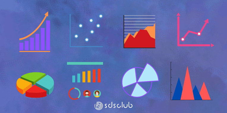
In this post, we‘ll cover 8 of the most essential charts that every data visualization practitioner should know. We‘ll explain what each chart is best used for and share some tips and examples. By the end, you‘ll have a solid foundation to start creating professional-quality visualizations of your own.
Why Data Visualization Matters
Before we dive into the specific charts, let‘s discuss why data visualization is so important in the first place. Here are a few key reasons:
-
Faster insights. Visualizations help our brains process information much faster than staring at a spreadsheet of raw numbers. Charts and graphs allow us to quickly spot patterns, outliers, and trends.
-
Better communication. Visuals are a universal language that can break through the clutter and convey insights to any audience, from executives to front-line workers. Well-designed charts focus attention on what‘s important.
-
More persuasive. There‘s a reason we say "show me the data". Visualizations lend an air of credibility and objectivity to any argument. Charts are simply more convincing than a wall of text and numbers.
-
Facilitate exploration. Interactive visualizations allow users to dive deep into the data and uncover their own insights. The right visual can spark curiosity and encourage further analysis.
With this context in mind, let‘s turn our attention to the 8 charts you need to know.
1. Bar Charts
The bar chart is perhaps the most common and versatile chart type. It‘s best for comparing different categories of data, either horizontally or vertically.

Use bar charts when you want to show relative sizes or proportions between different discrete categories. Order bars from largest to smallest to facilitate comparison.
Some use cases for bar charts include:
- Comparing sales by region
- Showing survey responses by category
- Visualizing market share among competitors
Keep bar charts clean and minimal. Start the y-axis at zero, and limit the number of bars to focus on the most important categories.
2. Line Charts
Line charts are used to visualize a series of continuous data points, typically over a period of time. They are great for showing trends, patterns, and volatility.

Use line charts when you want to plot changes in a variable over time or show the relationship between two continuous variables. You can plot multiple lines to compare different series.
Some common use cases for line charts include:
- Stock price movement over time
- Changes in key metrics like revenue or users
- Comparing performance of different A/B test variants
With line charts, pay attention to your axis scales and increments. Use colors and labels strategically to differentiate series. For large datasets, consider adding interaction like panning and zooming.
3. Pie Charts
Pie charts are used to show the composition and proportions of categorical data, where each "slice" represents a percentage of the whole. While overused, pie charts can effectively show relative proportions at a glance.

Use pie charts when you want to convey how a whole is divided into distinct parts. Limit the number of slices to 5-7 to avoid visual clutter. Pie charts shouldn‘t be used when the total doesn‘t add up to a meaningful whole.
Some common use cases for pie charts include:
- Showing market share
- Visualizing survey response percentages
- Budget or revenue breakdown by category
Order slices from largest to smallest and use a strong contrast between slice colors. Always include data labels and percentages on or near each slice. For more than 7 categories, consider using a bar chart instead.
4. Scatter Plots
Scatter plots are used to visualize the relationship between two continuous variables. Each data point is plotted individually as a dot, whose position depends on its value for each of the two variables.

Use scatter plots when you want to understand how one variable is affected by another. A tight clustering of dots indicates a strong correlation. Outlier dots can identify anomalies worthy of investigation.
Typical use cases for scatter plots include:
- Comparing marketing spend vs. revenue
- Plotting product price vs. consumer ratings
- Identifying outliers and clusters in a dataset
With scatter plots, be sure to start both axes at zero. Use color and shape to distinguish between different data series or categories. Scatter plots are often used in the exploratory analysis phase of a project.
5. Heatmaps
Heatmaps use color intensity to visualize the magnitude of values in a matrix. They provide a quick way to understand the distribution and variance of values and identify "hot spots".

Use heatmaps to find patterns in tables of numbers, where the individual values are less important than the overall distribution. Heatmaps can also be used to show the relationship between two categorical variables.
Some use cases for heatmaps include:
- Visualizing performance across different cohorts and metrics
- Showing correlations between variables
- Identifying usage trends and patterns in a product
Pay close attention to your color scheme with heatmaps. Sequential schemes should be used for unipolar data that ranges from low to high. Diverging schemes are best for visualizing data with a central, meaningful value like zero.
6. Gantt Charts
Gantt charts are a type of horizontal bar chart used to visualize projects or schedules over time. The x-axis represents time, while the bars show the start and end dates of different tasks, milestones, and resources.

Use Gantt charts to illustrate a project timeline or visualize resource allocation over time. They help uncover bottlenecks and keep tasks on track.
Typical use cases for Gantt charts include:
- Planning and tracking project timelines
- Visualizing team workloads and capacity
- Showing start and end dates of marketing campaigns
With Gantt charts, use a consistent date range and time increments. Break complex projects into major milestones. Color-code tasks by category, resource, or priority. Interactive Gantt charts are ideal for project monitoring.
7. Bubble Charts
Bubble charts are a variation of the scatter plot, where an additional third variable is represented through the size of the dots or "bubbles". This allows for multivariate analysis of three dimensions in one visualization.

Use bubble charts when you have three related variables, two of which are best represented on a continuous scale. The size of the bubbles adds a visual cue about relative importance and proportion.
Bubble charts are commonly used for:
- Plotting financial data like market cap, revenue and profit
- Visualizing election results by population size
- Comparing performance, usage, or spend across products and segments
Bubble charts can be tricky to interpret, so keep them simple and clearly label each bubble. Be intentional with your use of size and color to facilitate accurate comparisons.
8. Box Plots
Box plots, or box-and-whisker plots, are used to show the distribution of a dataset through its quartiles. The "box" contains the middle 50% of data points, while the "whiskers" extend to the min and max values. The line inside the box represents the median.

Use box plots to compare distributions between several groups or categories. They are best for larger datasets, where showing every data point would be too cluttered to be meaningful.
Some common use cases for box plots include:
- Comparing test scores across different student cohorts
- Visualizing salaries by job title or department
- Identifying outliers and data skew
Box plots provide a standard way to display the distribution of data based on a five number summary: minimum, first quartile, median, third quartile, and maximum. Outliers are plotted as individual points. Box plots are non-parametric: they display variation in samples of a statistical population without making any assumptions of the underlying statistical distribution.
Choosing the Right Chart
With an understanding of these 8 essential chart types, how do you decide which one to use for a given situation? Here are a few key factors to consider:
-
Type of data. Is your data continuous or categorical? Numeric or non-numeric? Answering these questions will immediately narrow down your chart choices.
-
Number of variables. How many variables do you want to compare or analyze? Some charts are better for univariate or bivariate analysis, while others can handle multiple dimensions.
-
Purpose of the visual. Are you trying to compare categories, show composition, analyze distribution, understand trends, or something else? Let your intent guide your chart selection.
-
Data size. Do you have a small or large dataset? Some charts are better for larger amounts of data, while others are ideal for quickly conveying insights from a few data points.
-
Audience. Who will be viewing your chart and what are their expectations? Always tailor your visuals to your audience to maximize impact and understanding.
Tools for Creating Charts
Now that you know what charts to create, what tools can you use to actually build them? Here are some of the most popular tools and libraries for data visualization:
- Microsoft Excel
- Tableau
- Looker
- PowerBI
- R (ggplot)
- Python (Matplotlib, Seaborn, Plotly)
- D3.js
Each of these tools has its own strengths, from Excel‘s ubiquity to Python‘s flexibility to Tableau‘s drag-and-drop interface. There‘s no single "best" tool – it ultimately depends on your specific needs, workflow, and preferences.
Data Visualization Best Practices
Regardless of the tool you use, there are several best practices to keep in mind when creating data visualizations:
-
Keep it simple. Avoid clutter, excessive colors and decorations. Every element should have a purpose.
-
Choose the right chart. Consider the type of data, relationships, and point you‘re trying to make.
-
Optimize for your audience. Who will be viewing the visualization and what do you want them to understand?
-
Use clear labels. Avoid acronyms or confusing terms. Every label should be easily understood.
-
Focus attention. Use color, size, and positioning intentionally to highlight key insights and guide the eye.
-
Provide context. What is the visualization telling us and why does it matter? Don‘t make your audience guess.
-
Iterate and get feedback. Build, test, and revise. Solicit feedback from others to catch things you may have missed.
Conclusion
We‘ve covered a lot in this post, from why data visualization matters to 8 essential chart types to tools and best practices. But data visualization is a skill best learned by doing.
Start putting these charts to use with your own data. Experiment with different tools and see what works best for your needs. Over time, you‘ll develop an intuition for what charts to use when and how to design them for maximum insight and impact.
Remember, the goal of data visualization is to turn numbers into knowledge. A well-crafted chart can spark discussion, drive decisions, and change minds. Master this skill and you‘ll become indispensable in our data-driven world.