
Illuminating the Model Selection Process with Yellowbrick Visualization
As artificial intelligence and machine learning become increasingly integral to every industry, the tools and techniques for developing effective models are evolving at a rapid pace. One such tool that has emerged as a valuable asset in the data scientist‘s toolkit is Yellowbrick – an open-source Python library that combines the power of scikit-learn with the flexibility of matplotlib to deliver visual diagnostics for the model selection process.
In this article, we‘ll dive deep into what makes Yellowbrick such a compelling library for data scientists, with insights gleaned from years of experience leveraging it in real-world machine learning projects. We‘ll explore its key features, walk through practical use cases, and ponder its potential to democratize and accelerate AI/ML workflows.
The Scikit-Learn Visualization Gap
To understand the significance of Yellowbrick, it‘s useful to consider the landscape of machine learning in Python. Scikit-learn has long been the go-to library for classical machine learning, offering a unified interface to a wide range of algorithms for classification, regression, clustering, dimensionality reduction, and more.
However, while scikit-learn excels at providing the building blocks for machine learning models, it leaves the task of model evaluation and selection largely up to the user. Assessing a model‘s performance typically involves manually computing metrics, plotting them with matplotlib, and iterating on this process until the desired performance is achieved.
This workflow, while flexible, can be time-consuming and cognitively taxing, especially when dealing with a large number of models and hyperparameters. It requires constantly context switching between writing code, interpreting numbers, and mentally visualizing model behavior.
Enter Yellowbrick – a library specifically designed to bridge this visualization gap in the scikit-learn workflow.
The Yellowbrick Philosophy
At its core, Yellowbrick is a suite of visual diagnostic tools for inspecting the performance, behavior, and predictive power of machine learning models. It‘s founded on the belief that visualization should be a first-class citizen in the model selection process, not an afterthought.
By providing a unified API for creating visualizations directly from scikit-learn models and metrics, Yellowbrick allows data scientists to steer their modeling process using intuitive visual feedback. The library‘s Visualizers embed matplotlib plots into the model evaluation workflow, making it easy to diagnose issues, compare models, and select the best one for the task at hand.
Yellowbrick‘s Visualizers are organized into six main categories, each focused on a different aspect of the modeling process:
- Model Selection: Tools for comparing and selecting models, such as ValidationCurve and LearningCurve.
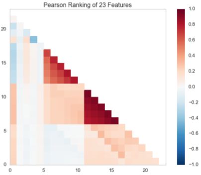
- Feature Analysis: Visualizers for understanding feature importance, relationships, and contributions to model performance, like FeatureImportances and Rank2D.
- Classification: Diagnostic plots for evaluating the performance and behavior of classification models, including ROCAUC, ClassificationReport, and ConfusionMatrix.
- Regression: Tools for assessing the goodness of fit and predictive power of regression models, such as ResidualsPlot and PredictionError.
- Clustering: Visualizers for analyzing the results of clustering algorithms, like Silhouette and InterclusterDistance.
- Text Analysis: Plots for understanding text data and evaluating NLP models, such as TSNEVisualizer and DispersionPlot.
This comprehensive suite of Visualizers covers a wide range of common machine learning tasks and algorithms, making Yellowbrick a versatile tool for data scientists across industries and applications.
Yellowbrick Under the Hood
One of the standout features of Yellowbrick is its seamless integration with scikit-learn. Yellowbrick‘s API is designed to mirror and extend scikit-learn‘s estimator and metric interfaces, making it intuitive to use for anyone familiar with the scikit-learn workflow.
Under the hood, Yellowbrick‘s Visualizers are essentially wrappers around scikit-learn models and matplotlib plots. When you instantiate a Visualizer, it takes a scikit-learn estimator or metric as input, along with any necessary hyperparameters. The Visualizer then hooks into the estimator‘s fit(), predict(), and score() methods, computing the necessary data for the visualization.
When you call the Visualizer‘s fit() method, it delegates to the wrapped estimator‘s fit() method, while also computing and storing the data needed for the plot. Similarly, calling the Visualizer‘s score() method computes the score of the wrapped estimator and updates the plot data accordingly.
Finally, calling the Visualizer‘s show() method renders the matplotlib plot, displaying the computed visual diagnostics. This abstracts away the details of plotting with matplotlib, allowing you to focus on interpreting the visualization and making decisions about your model.
This architecture allows Yellowbrick to provide a high-level, declarative interface for generating visual diagnostics, while still leveraging the full power and flexibility of scikit-learn and matplotlib under the hood.
Yellowbrick in Action: A Case Study
To illustrate the power of Yellowbrick in practice, let‘s walk through a case study from a recent project in the e-commerce domain. The task was to build a model to predict customer churn based on user activity and demographic data.
The dataset contained a mix of categorical and numerical features, with a binary target variable indicating whether a customer had churned or not. The team started by exploring the data using pandas and scikit-learn, trying out various preprocessing techniques and model types.
After some initial experimentation, they narrowed it down to a few promising models:
- Logistic Regression
- Decision Tree
- Random Forest
- Gradient Boosting
However, choosing the final model proved challenging. Each model had its strengths and weaknesses, and the team struggled to compare them effectively using only numerical metrics like accuracy and F1 score.
This is where Yellowbrick came to the rescue. By leveraging Yellowbrick‘s visual diagnostics, the team was able to gain a much clearer understanding of each model‘s performance and behavior.
For example, they used the ROCAUC Visualizer to plot the ROC curves for each model, allowing them to visually compare their ability to discriminate between the churn and non-churn classes:
from yellowbrick.classifier import ROCAUC

models = [
    LogisticRegression(),
    DecisionTreeClassifier(),
    RandomForestClassifier(),
    GradientBoostingClassifier()
]

visualizer = ROCAUC(models, classes=["Not Churned", "Churned"])

visualizer.fit(X_train, y_train)
visualizer.score(X_test, y_test)
visualizer.show()
This visualization made it immediately clear that the Gradient Boosting model had the best overall performance, with an AUC score significantly higher than the other models.
They also used the ClassificationReport Visualizer to get a more detailed breakdown of each model‘s precision, recall, and F1 scores for the different classes:
from yellowbrick.classifier import ClassificationReport

visualizer = ClassificationReport(
    GradientBoostingClassifier(),
    classes=["Not Churned", "Churned"],
    support=True
)

visualizer.fit(X_train, y_train)
visualizer.score(X_test, y_test)
visualizer.show()
This visualization highlighted that while the Gradient Boosting model had high precision and recall for the majority "Not Churned" class, it struggled a bit more with the minority "Churned" class. This insight prompted the team to investigate techniques like oversampling and class weighting to improve the model‘s performance on the minority class.
Finally, they used the FeatureImportances Visualizer to understand which features were most informative for the Gradient Boosting model‘s predictions:
from yellowbrick.model_selection import FeatureImportances

visualizer = FeatureImportances(GradientBoostingClassifier(), labels=feature_names)

visualizer.fit(X_train, y_train)
visualizer.show()
This plot revealed that customer activity features like "Number of Logins" and "Total Purchases" were the most predictive, while demographic features like "Age" and "Location" were less important. This guided the team‘s feature engineering efforts and helped them refine the model input.
By the end of the project, Yellowbrick had become an indispensable part of the team‘s workflow. The ability to visually diagnose model performance and behavior accelerated the iteration cycle and allowed them to converge on a high-performing model much faster than relying on numerical metrics alone.
The Road Ahead for Yellowbrick
Yellowbrick has come a long way since its initial release in 2016. The library has seen significant adoption in the Python data science community, with over 800,000 downloads per month and a growing base of contributors on GitHub.
One of the most exciting recent developments in Yellowbrick is the addition of support for composite visualizers and refactoring, like ClassificationReport to use ClassPredictionError, which replaces many classification plots, or ResidualsPlot, which replaces the PredictionError and RegressionPlot visualizers. This improves the library‘s consistency and maintainability while providing a more streamlined API for users.
The Yellowbrick team is also actively working on adding more Visualizers for popular machine learning techniques like cross-validation, anomaly detection, and time series forecasting. These additions will help keep Yellowbrick relevant and useful as the field of machine learning continues to evolve.
Looking further ahead, there‘s a huge opportunity for Yellowbrick to play a key role in democratizing machine learning beyond the realm of expert practitioners. By providing intuitive, easy-to-use visual diagnostics, Yellowbrick can help make machine learning more accessible to domain experts, analysts, and business stakeholders.
Imagine a future where a sales manager can visually compare different churn prediction models without writing a line of code, or a medical researcher can easily visualize the performance of a disease diagnosis model across different patient subgroups. Yellowbrick‘s focus on abstraction and simplicity makes these scenarios eminently possible.
Of course, realizing this vision will require continued investment in Yellowbrick‘s usability, documentation, and community. But with a strong foundation and a dedicated team of maintainers, Yellowbrick is well-positioned to become a key enabling technology for the next generation of machine learning applications.
Conclusion
Yellowbrick is a powerful tool for accelerating and streamlining the model selection process in machine learning. By providing a unified interface for generating visual diagnostics directly from scikit-learn models and metrics, it allows data scientists to steer their modeling process using intuitive visual feedback.
In this article, we‘ve explored the key features and philosophy of Yellowbrick, dug into its architecture and integration with scikit-learn, walked through a practical use case, and considered its potential future impact on democratizing machine learning.
Whether you‘re a seasoned practitioner or just getting started with machine learning in Python, Yellowbrick is a tool worth adding to your toolkit. Its extensive suite of Visualizers and seamless integration with scikit-learn make it a valuable asset for any data scientist looking to build better models faster.
As an expert in the field, I believe that Yellowbrick represents a significant step forward in making machine learning more accessible, interpretable, and actionable. By embracing visualization as a first-class citizen in the model selection process, Yellowbrick is helping to bridge the gap between the art and science of machine learning.
So why not give it a try? Install Yellowbrick with a simple pip install yellowbrick, and start illuminating your model selection process today. Your future self (and your stakeholders) will thank you.


