10 Must-Read Books on Data Visualization for AI and ML Professionals
Data visualization is a critical skill for artificial intelligence (AI) and machine learning (ML) professionals. As the volume and complexity of data continues to grow, the ability to translate data into meaningful visual insights is more important than ever.
According to the 2022 Big Data and AI Executive Survey from NewVantage Partners, 85% of companies are investing in data science and ML initiatives. However, the survey also found that the biggest barrier to success is the inability to interpret and act on model results. Effective data visualization can bridge this gap, enabling data scientists and analysts to communicate complex insights to business stakeholders in a clear, compelling way.
Beyond driving business impact, data visualization is also essential for the AI/ML workflow itself. Visualizing data is critical for understanding patterns, spotting anomalies, and guiding feature selection. Thoughtfully designed plots and charts can reveal important data characteristics that may be hidden in raw numbers.
As AI/ML expert Andrew Ng notes in his book "Machine Learning Yearning":
It is difficult to understand a dataset without visualization. When you visualize your data, you‘ll develop intuitions that will help you create a better model and find good features to use.
In this article, I‘ll share my top book recommendations for AI/ML practitioners looking to level up their data visualization skills. Whether you‘re a beginner or an advanced practitioner, these books will give you the knowledge and inspiration to create data visualizations that inform, engage, and persuade.
For Beginners
1. Storytelling with Data: A Data Visualization Guide for Business Professionals
by Cole Nussbaumer Knaflic (2015)
This accessible, engaging book is my top pick for AI/ML professionals new to data visualization. Knaflic, a former Google analyst, breaks down the process of creating compelling data stories into simple, learnable steps. You‘ll learn how to:
- Choose the right visual based on your data and message
- Identify and strip out clutter
- Draw your audience‘s attention to key insights
- Integrate narrative elements to create a cohesive story
Filled with real-world examples and practical tips, this book will give you a solid foundation in data visualization best practices. I especially appreciate how Knaflic emphasizes the importance of context and audience in visualization design – critical considerations for AI/ML professionals collaborating with diverse stakeholders.
2. Fundamentals of Data Visualization
by Claus O. Wilke (2019)
Wilke provides a comprehensive overview of the principles behind effective data visualization, covering topics like human perception, color theory, and chart design. Compared to other introductory texts, this book goes into more technical detail on visualization in data science, with extensive examples in R and ggplot2.
One of the strengths of this book is how it connects visualization principles to statistical concepts like uncertainty, sampling, and dimensionality reduction. This makes it an ideal resource for data scientists and ML engineers looking to build intuition around visualizing model results and performance metrics.
The book also includes thoughtful advice on how to integrate data visualization into your everyday workflow. As Wilke notes:
Visualizing data is not a separate task from analyzing data. They are two sides of the same coin, and you cannot do one without the other.
3. Data Visualization: Charts, Maps, and Interactive Graphics
by Robert Grant (2018)
This book is a great choice for beginners looking for a more hands-on introduction to data visualization in Python. Grant, a data visualization specialist at the UNESCO Institute for Statistics, walks through the process of creating static, animated, and interactive visualizations using popular Python libraries like Matplotlib, Seaborn, and Bokeh.
One highlight of the book is the chapter on geographic data, which covers techniques for creating choropleths, cartograms, and flow maps. This is especially relevant for AI/ML use cases involving spatial data, such as computer vision applications for satellite imagery and autonomous vehicles.
The book‘s GitHub repository contains Jupyter notebooks with all the code examples, making it easy to follow along and experiment on your own. For data scientists comfortable with Python, this book is a great way to quickly start applying data visualization techniques to your AI/ML projects.
For Intermediate Practitioners
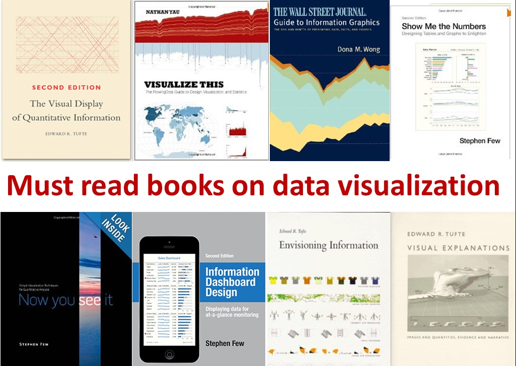
4. The Visual Display of Quantitative Information
by Edward Tufte (1983)
Tufte‘s landmark book is essential reading for anyone serious about data visualization. Originally published almost 40 years ago, its insights on visualizing complex, multivariate data continue to be relevant and widely applied in AI/ML contexts.
Tufte introduces several key concepts, such as:
- Data-ink ratio: the proportion of ink devoted to depicting actual data vs. decorative elements
- Chartjunk: visual elements that detract from understanding the data
- Small multiples: using multiple small views of data to quickly reveal patterns and anomalies
These principles provide a useful framework for evaluating the effectiveness of data visualizations and identifying areas for improvement. Tufte‘s ideas have been particularly influential in dashboard and monitoring tool design for AI/ML systems.
While some of the examples may feel a bit dated, Tufte‘s core lessons on maximizing the clarity and efficiency of quantitative displays are timeless. Every data visualization created by an AI/ML practitioner would benefit from a ruthless focus on Tufte‘s mantra: "Above all else, show the data."
5. Visualize This: The FlowingData Guide to Design, Visualization, and Statistics
by Nathan Yau (2011)
Yau, the creator of the popular FlowingData blog, provides a highly practical, learn-by-doing introduction to data visualization. The book walks through dozens of real-world examples of how to use tools like R and Python to scrape, wrangle, and visualize data.
From an AI/ML perspective, I found the chapters on visualizing time series, proportions, and geographic data especially useful. Yau demonstrates how to create clear, engaging visuals for common data types encountered in data science and ML projects.
Another strength of the book is the emphasis Yau places on developing your own unique visualization style:
Your main goal should be to communicate data as effectively as possible. Aesthetics are important, but they should play a secondary role. As you work with and study data more, you‘ll develop your own style and techniques that work well for the stories you want to tell.
This is great advice for AI/ML practitioners, who often need to tailor their visualizations to specific audiences and use cases. The book will equip you with the tools and creative inspiration to do just that.
6. The Big Book of Dashboards: Visualizing Your Data Using Real-World Business Scenarios
by Steve Wexler, Jeffrey Shaffer, and Andy Cotgreave (2017)
Dashboards are a key deliverable for many AI/ML projects, providing a real-time window into system performance and business metrics. This unique book provides a gallery of 28 real-world dashboards created for companies across industries, with in-depth explanations of the design rationale behind each one.
The book is organized around different business scenarios and goals, such as executive reporting, sales and marketing, and project management. For each scenario, the authors walk through the key performance indicators (KPIs), intended audience, and design choices involved in building the dashboard.
AI/ML practitioners will get a lot of value out of the book‘s discussion of common dashboard design pitfalls and best practices, such as:
- Choosing the right chart type for the data and message
- Providing adequate context through titles, labels, and annotations
- Maintaining a consistent color scheme and layout across dashboard elements
- Progressively revealing complexity based on user needs and drill-down behavior
Perhaps most importantly, the book hammers home the importance of deeply understanding the needs of your dashboard audience. As the authors note, "It doesn‘t matter how good your data is, how well-built your model is, or how pretty your dashboard is if it doesn‘t help your audience make better decisions."
For Advanced Practitioners
7. Visualization Analysis and Design
by Tamara Munzner (2014)
This book, written by a computer science professor at the University of British Columbia, provides a deeply technical and comprehensive look at data visualization theory and practice. It‘s especially well-suited for AI/ML engineers and researchers looking to ground their visualization designs in a rigorous, scientific framework.
Munzner introduces a systematic approach to visualization design, covering aspects like:
- Data abstraction: What are the underlying characteristics of your dataset, and how do they map to visual encoding choices?
- Task abstraction: What questions are users trying to answer with the visualization, and what interactions are required to support those tasks?
- Visual encoding: How can you leverage visual channels like position, color, and size to effectively encode data?
- Interaction: What interaction techniques (filtering, drill-down, etc.) are appropriate for the data and task?
One of the key contributions of the book is the "nested model" framework Munzner proposes for breaking down the visualization design process. By considering data, task, encoding, and interaction in a hierarchical fashion, you can make design choices in a principled way while identifying threats to validity at each stage.
The book also emphasizes the importance of rigorously validating visualization designs through techniques like user studies, heuristic evaluation, and algorithm benchmarking. This focus on empirical validation is especially crucial in an AI/ML context, where visualizations are often used to debug models and build trust with end users.
While the book is quite dense and theoretical at times, it provides an essential foundation for AI/ML practitioners looking to create truly innovative, research-quality data visualizations.
8. Multivariate Data Visualization with R
by Kevin Keen (2018)
As the dimensionality of AI/ML datasets continues to grow, the ability to effectively visualize multivariate data is increasingly important. This book provides a comprehensive guide to multivariate visualization techniques using the R programming language.
Keen covers a wide range of statistical graphics, including:
- Geometric techniques: scatterplot matrices, parallel coordinate plots, radial coordinate visualization
- Pixel-oriented techniques: corrgrams, heatmaps
- Hierarchical techniques: cluster heatmaps, dendrograms, treemaps
- Graph-based techniques: network visualization, force-directed layouts
For each technique, Keen provides a detailed explanation of how it works, when it‘s appropriate to use, and how to implement it in R. The book strikes a nice balance between theory and application, with plenty of code examples to help you get started.
One of the highlights of the book is the chapter on interactive graphics, which shows how to create dynamic, web-based visualizations using tools like plotly, htmlwidgets, and Shiny. This is especially valuable for AI/ML practitioners looking to create interactive dashboard and reporting solutions.
Another useful section of the book covers techniques for visualizing high-dimensional data, such as t-SNE and PCA. Understanding how to visualize the output of dimensionality reduction algorithms is critical for interpreting and communicating AI/ML results.
Overall, this book is an excellent resource for intermediate to advanced AI/ML practitioners looking to expand their multivariate data visualization toolkit in R.
9. Visual Analytics with Tableau
by Alexander Loth (2019)
Tableau is one of the most popular business intelligence and data visualization platforms, with a growing presence in the AI/ML ecosystem. This book provides a comprehensive guide to using Tableau to explore, analyze, and communicate data insights.
While not specific to AI/ML, the book covers many visualization techniques that are highly relevant for data science and ML workflows, such as:
- Connecting to and blending disparate data sources
- Creating calculated fields to derive new insights
- Designing interactive dashboards to enable data exploration
- Integrating statistical analysis and modeling with visual analytics
- Collaborating and sharing insights across the organization
One of the strengths of the book is the variety of real-world examples and case studies it includes. Loth demonstrates how Tableau can be used to visualize everything from sales data to social media metrics to IoT sensor readings.
For AI/ML teams that use Tableau as part of their toolkit, this book provides a wealth of practical knowledge and inspiration. It will help you move beyond basic charts and graphs to create truly impactful, interactive data visualizations.
Conclusion and Next Steps
Data visualization is a powerful tool for AI/ML professionals to explore data, evaluate models, and communicate insights to stakeholders. By reading these books and applying their lessons to your own work, you‘ll be well on your way to creating data visualizations that inform, engage, and persuade.
But the learning doesn‘t stop there. To further develop your skills, I recommend:
-
Practice, practice, practice. The best way to internalize data visualization concepts is to apply them to real data. Commit to creating at least one new visualization per week, whether it‘s for a work project or a personal dataset that interests you.
-
Study examples in the wild. Whenever you come across a data visualization in an article, report, or dashboard, take a moment to critically examine it. What works well? What could be improved? How might you apply similar techniques to your own data?
-
Engage with the community. Follow data visualization experts on social media, attend meetups and conferences, and participate in online forums. The data visualization community is incredibly generous with their knowledge and always willing to provide feedback and advice.
-
Collaborate with others. Work with designers, developers, and subject matter experts to create visualizations that combine technical excellence with domain knowledge. Diverse perspectives will only make your visualizations stronger.
-
Embrace new tools and technologies. Stay up to date with the latest developments in data visualization software, libraries, and frameworks. Don‘t be afraid to experiment with new approaches, such as virtual reality and augmented reality displays for complex ML datasets.
By continuously learning and pushing the boundaries of what‘s possible, you‘ll be able to create data visualizations that not only convey important insights, but also inspire and delight your audiences. As an AI/ML professional, that‘s an incredibly powerful skill to have in your toolkit.